CATALOGUE
OF MAKING
Data Object Outcomes
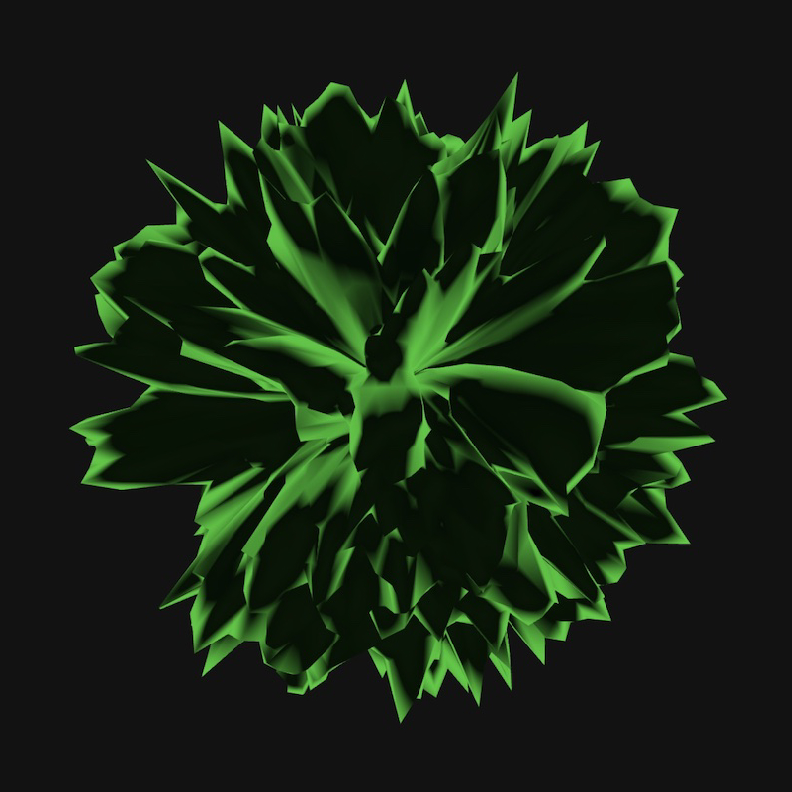
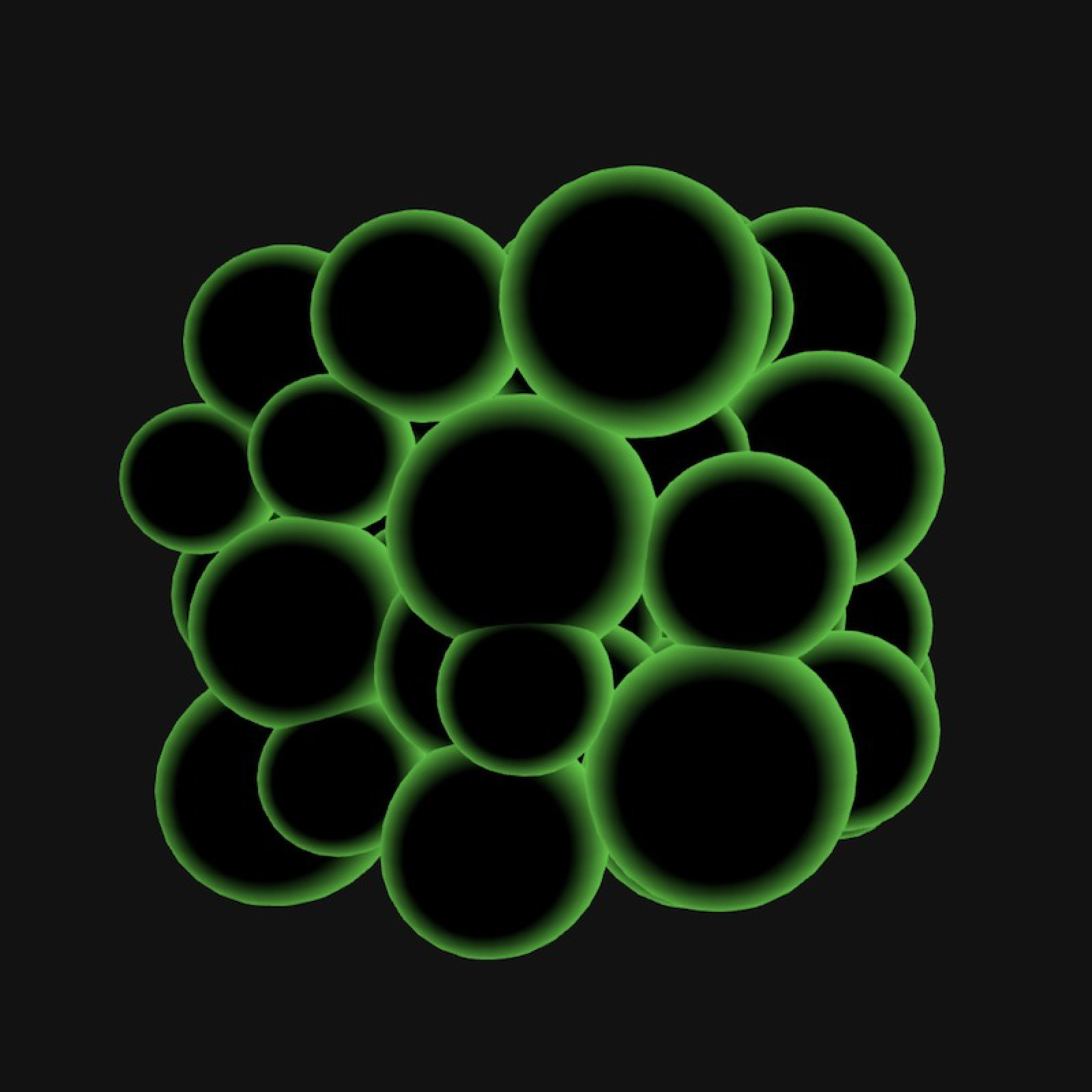
The concept for this prototype surrounds data as a tangible form that can be interpreted through a sense of touch, connecting our digital and physical selves on a sensory level. This experiment explores how data objects can express emotions and tone of voice of individuals as a form of identity representation.
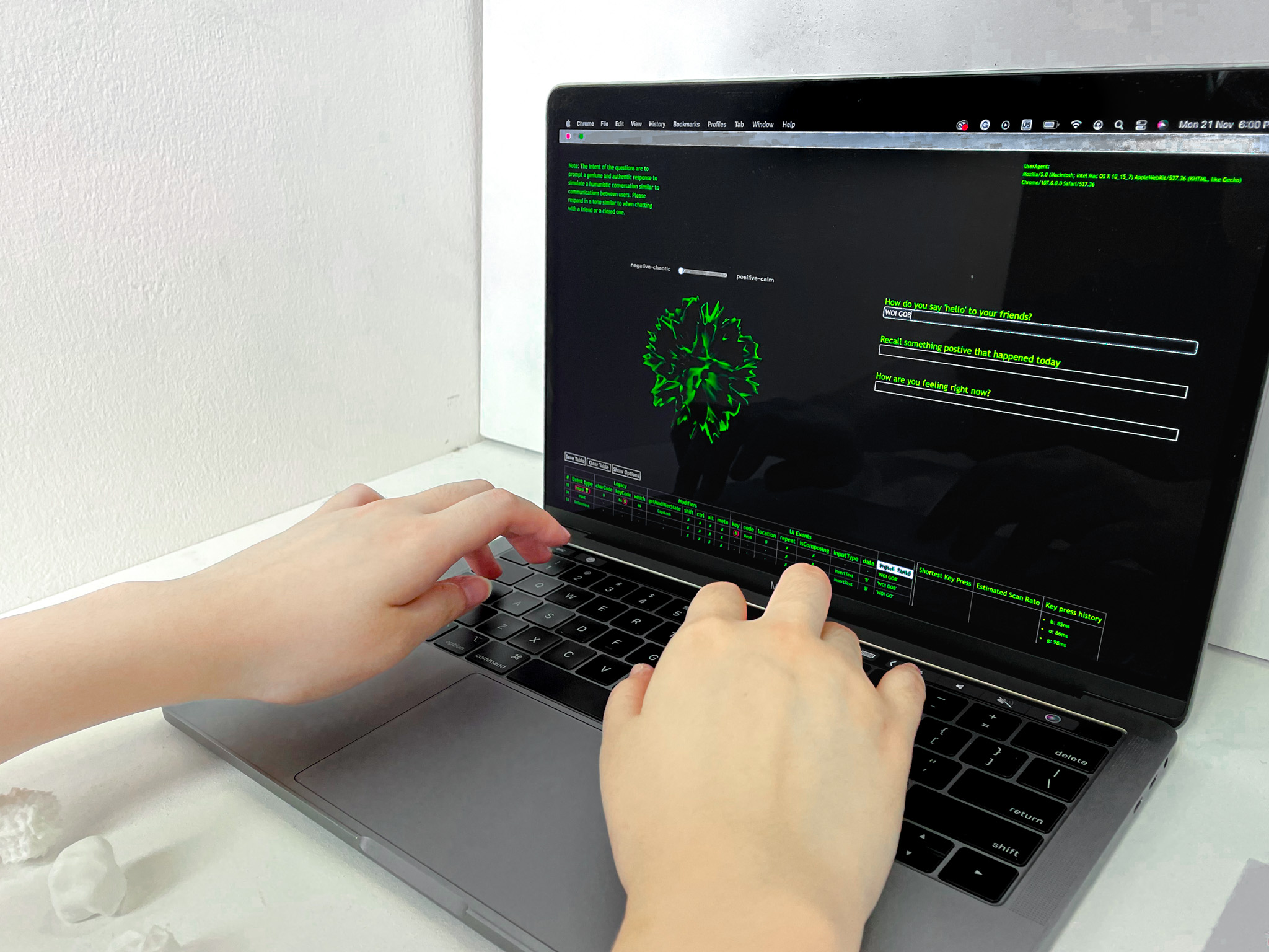
To do so, data analysis will be conducted on keystroke data that have been recorded by participants. This is because research on keystroke psychology has shown that users type slower while in a negative emotional state, on the contrary users type faster when they are in a positive emotional state. As a result, this prototype utilises keystroke patterns as a way to detect behaviour changes in the analysis of emotional states.
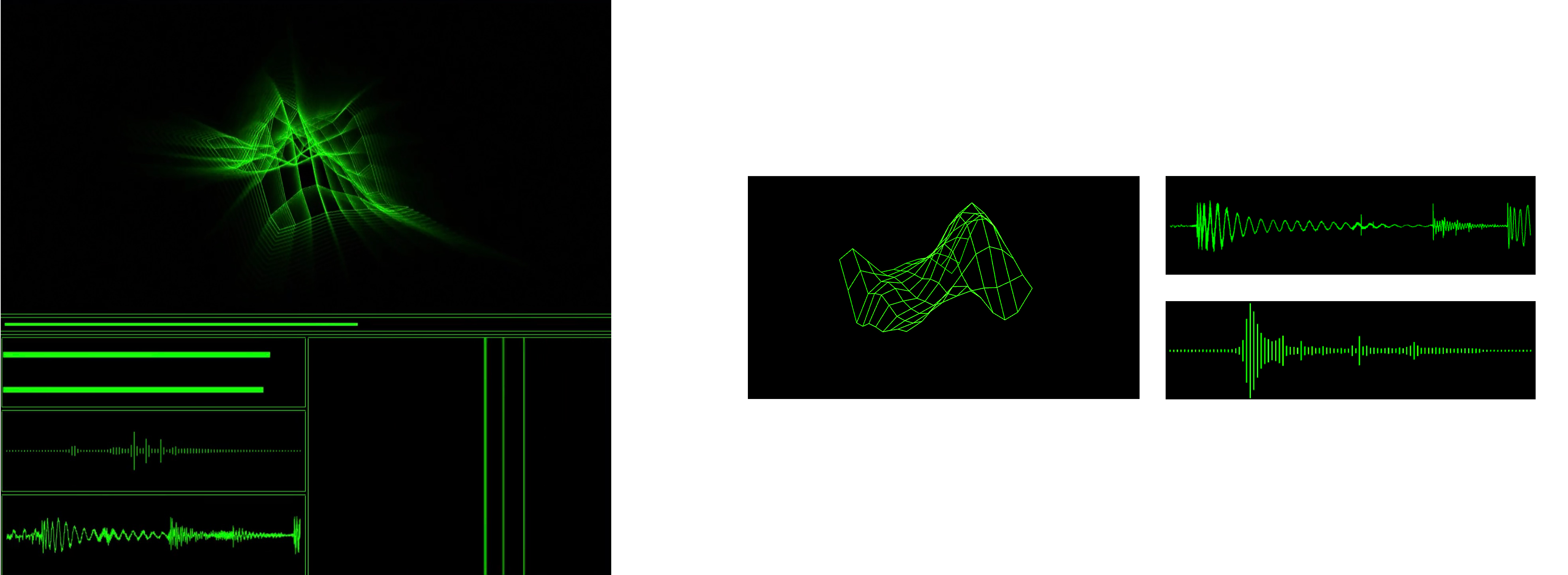
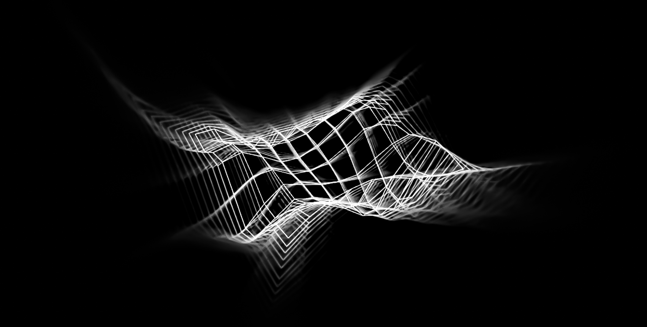
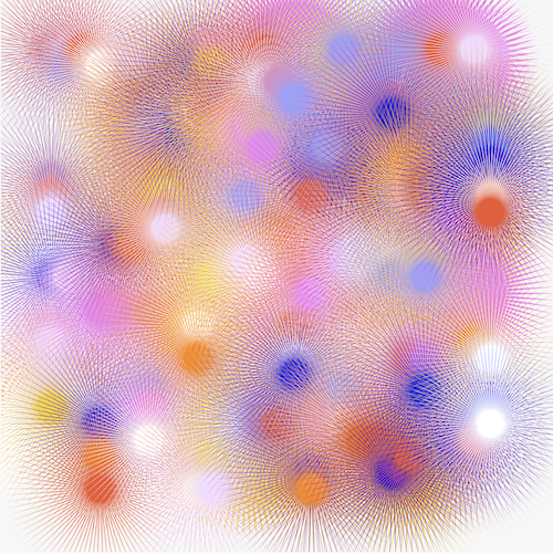
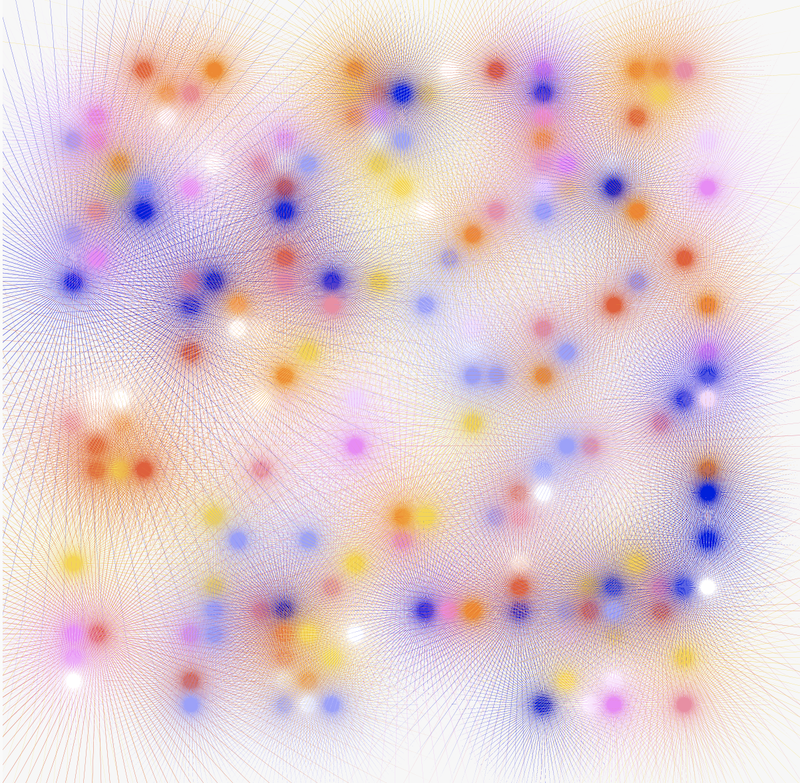
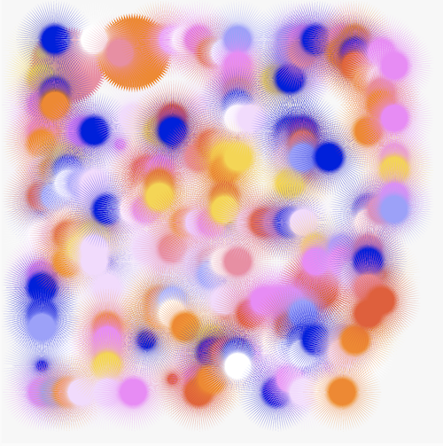
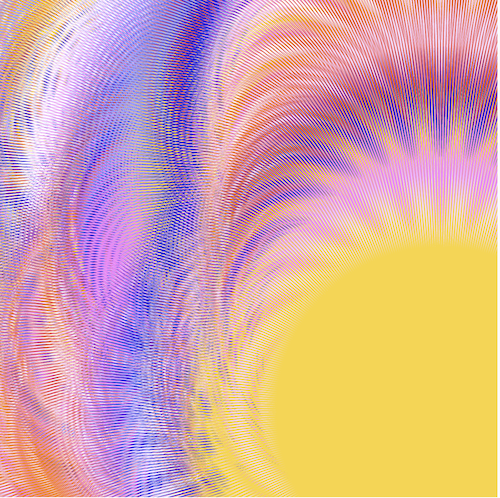
In the initial phases of this prototype, various visual mediums were explored in its functional and aesthetical areas. The prototype has undergone three experiments, using Blender for the 3D render, next to P5.js to produce the 3D objects in a coded space, and lastly a combination of Blender + P5.js to situate the 3D designed objects in a generative environment.
3D Material Making
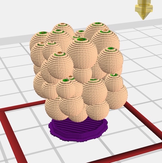
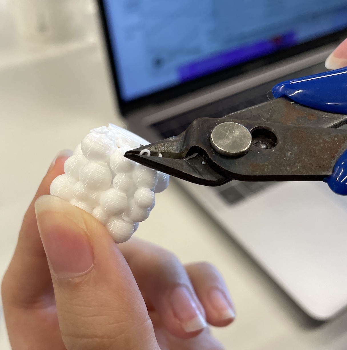
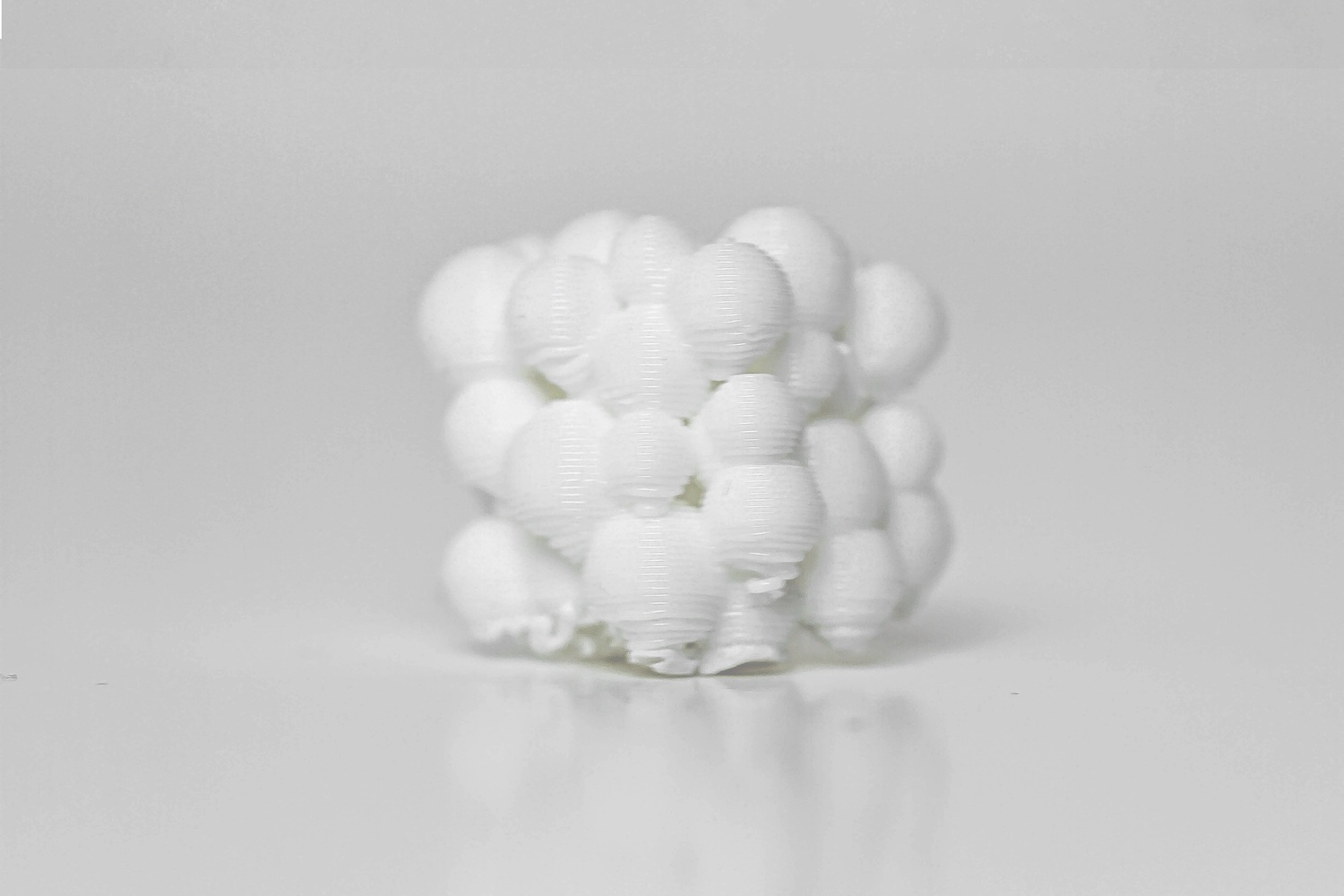
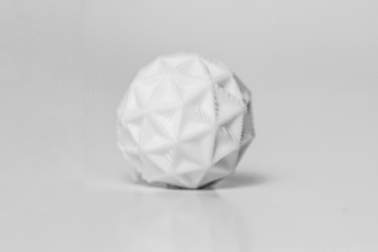
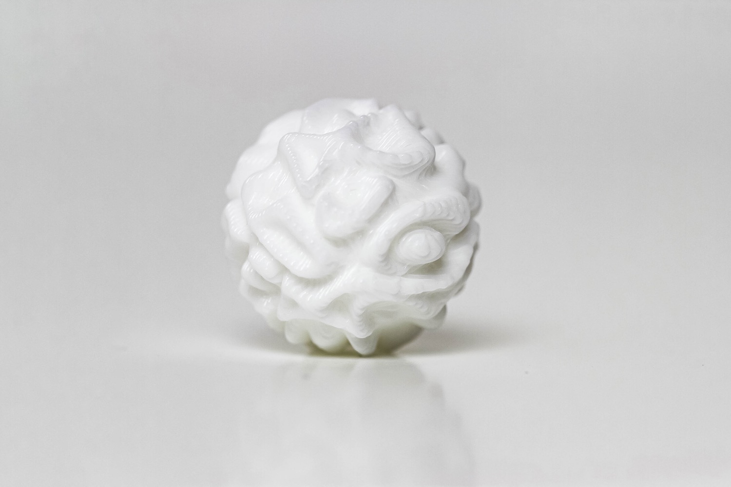
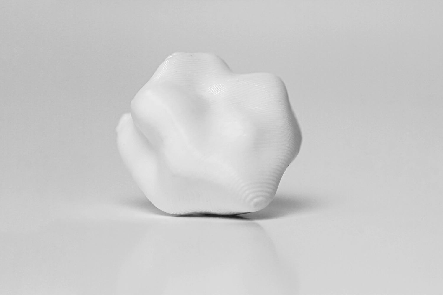
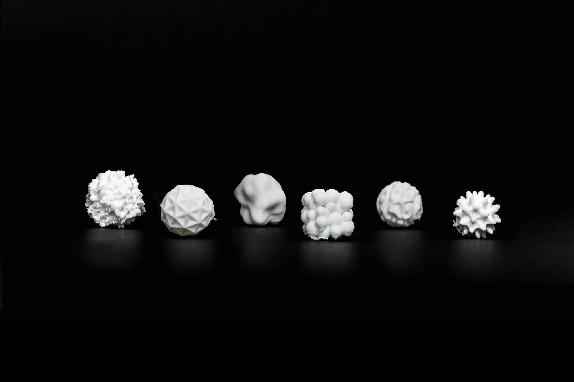
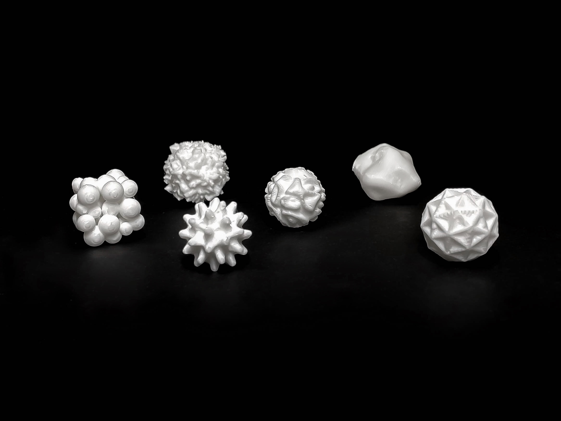
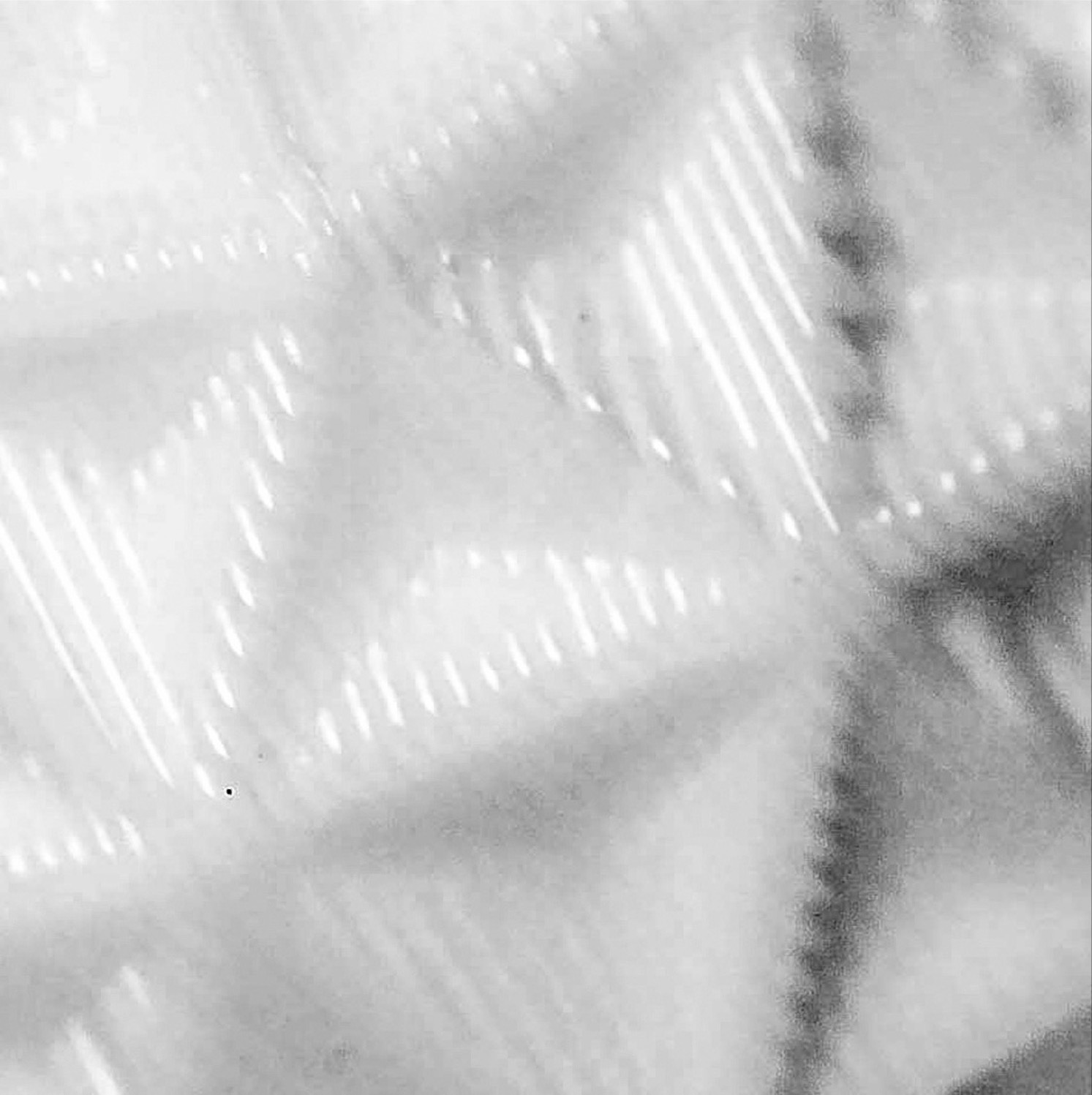
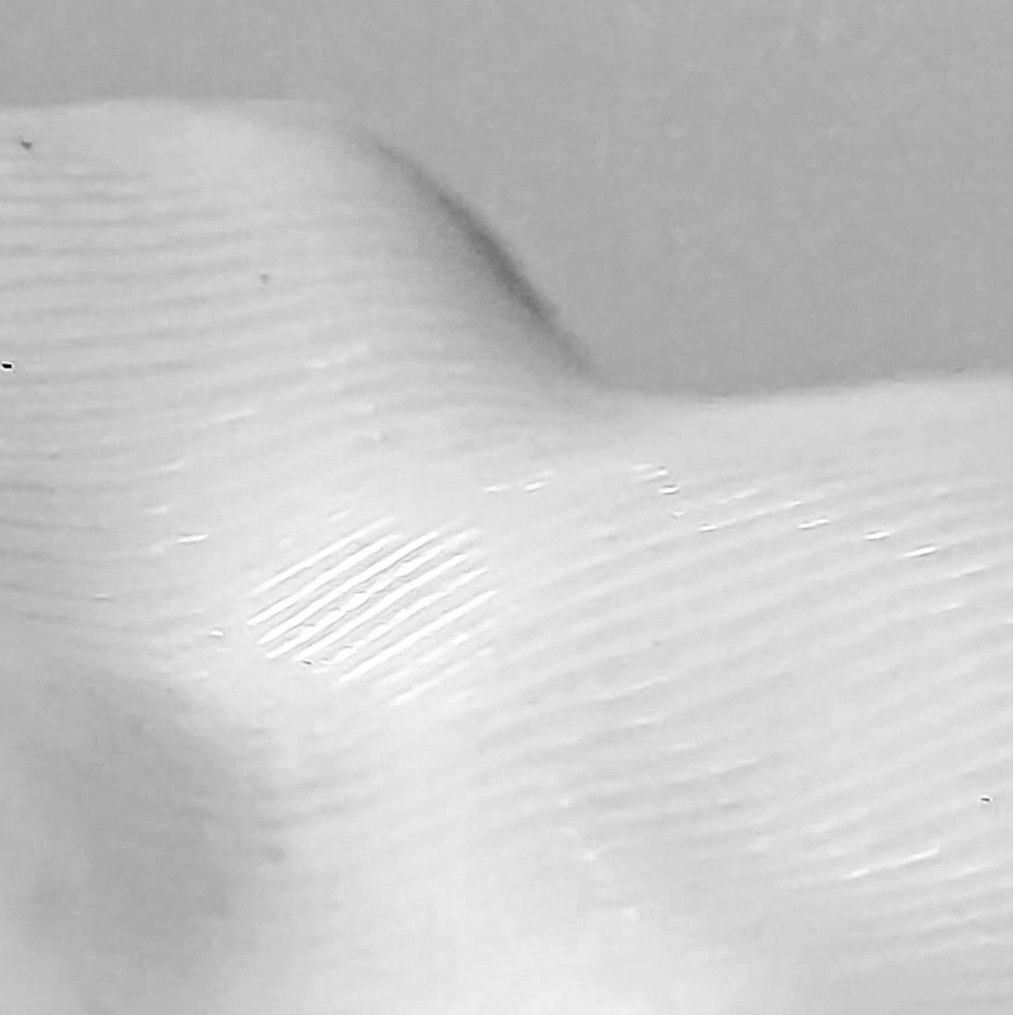
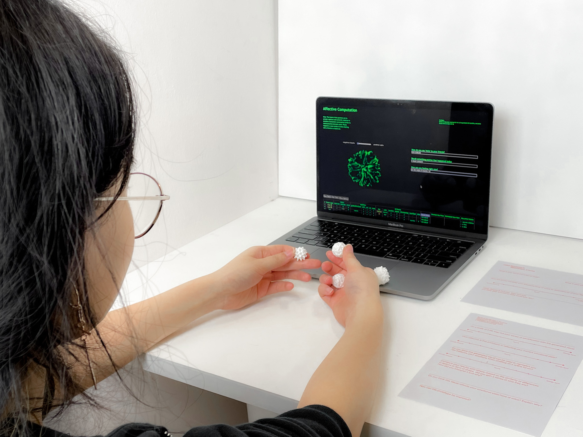
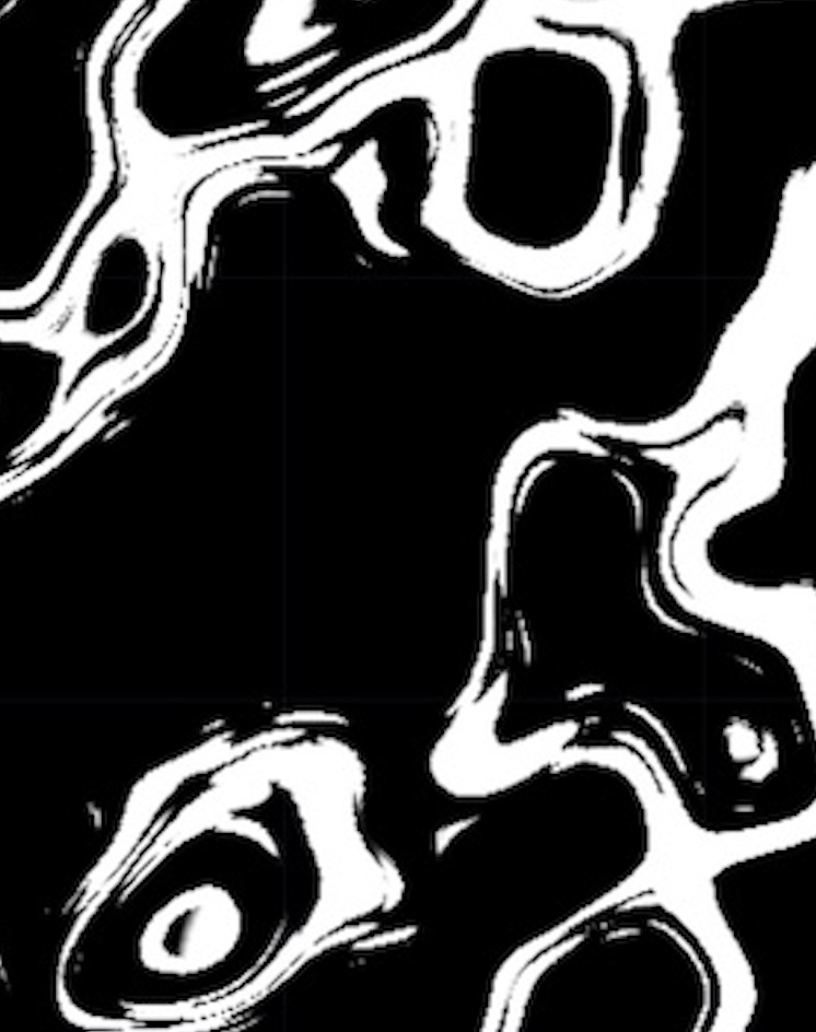
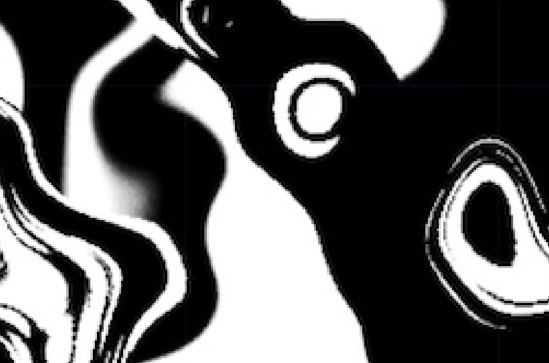
To connect the user’s digital and physical identities, the concept of bridging the distance between digital and physical realms are brought forth. By materialising the digital affective data objects into printed 3-dimensional objects that can be physically interacted with, presenting users with an all-rounded experience that engages both their digital and physical selves. For the physical application, the digital objects were transformed into 3D printed sensory objects, allowing users to feel connected through the sense of touch. The focus of the physical prototype was the sensorial experience of shape form and texture, as a way to interpret complexity through tactile senses.


USER TESTING
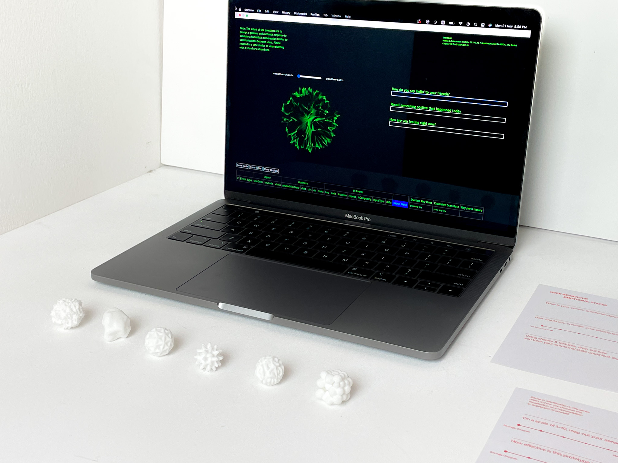
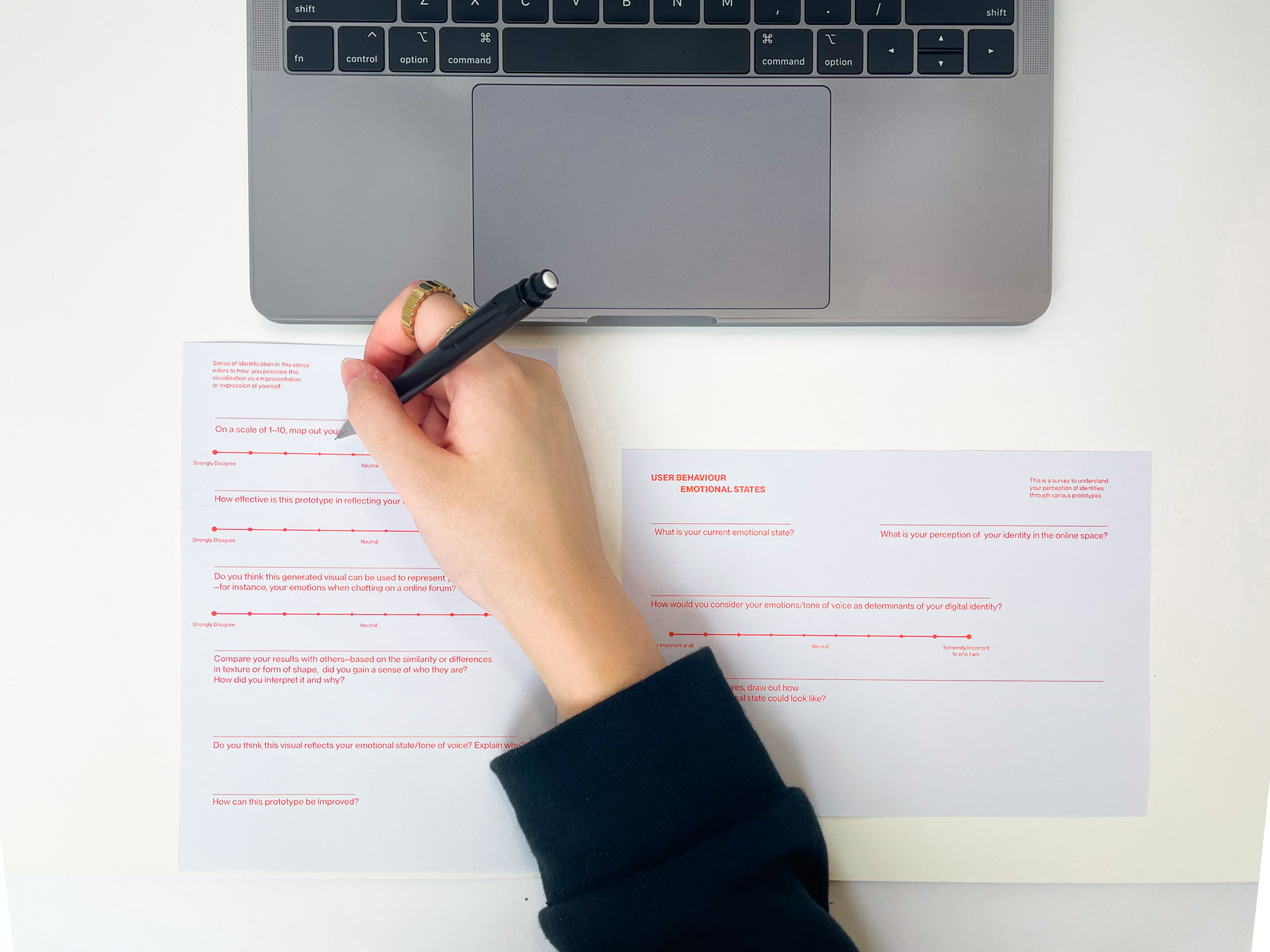
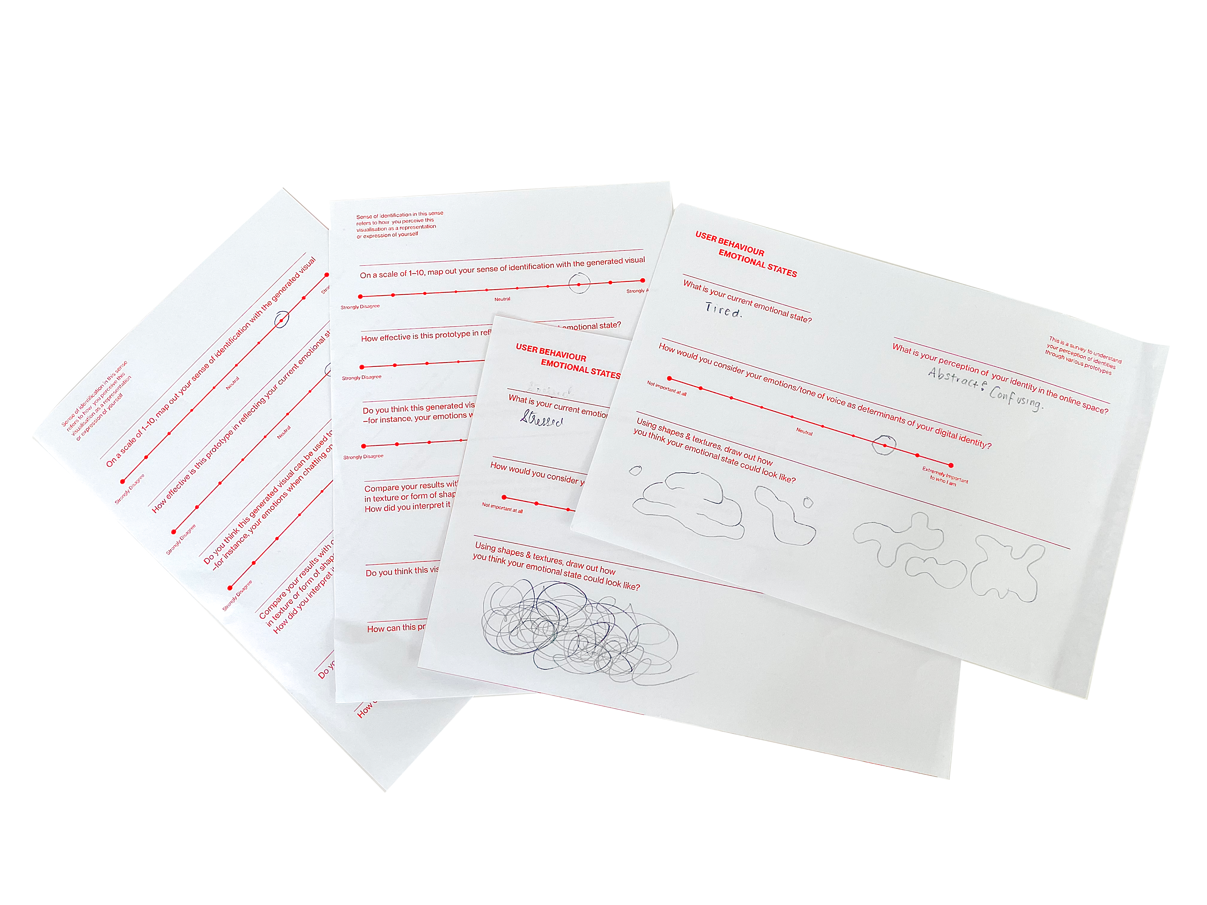
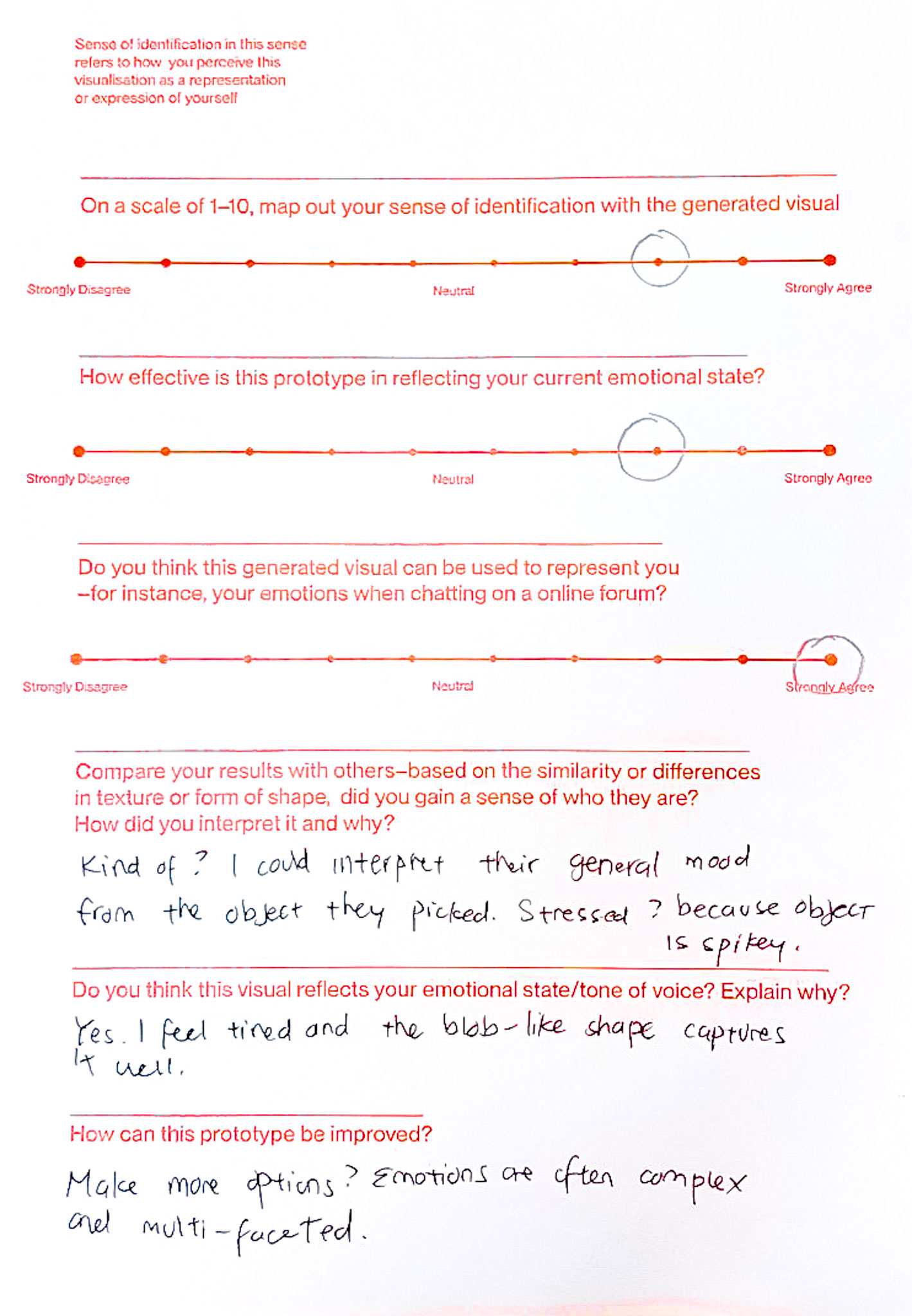
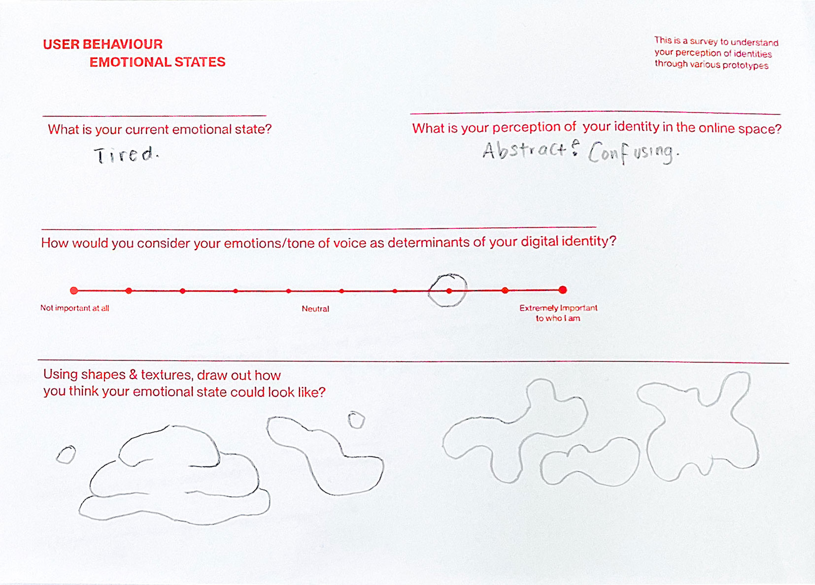
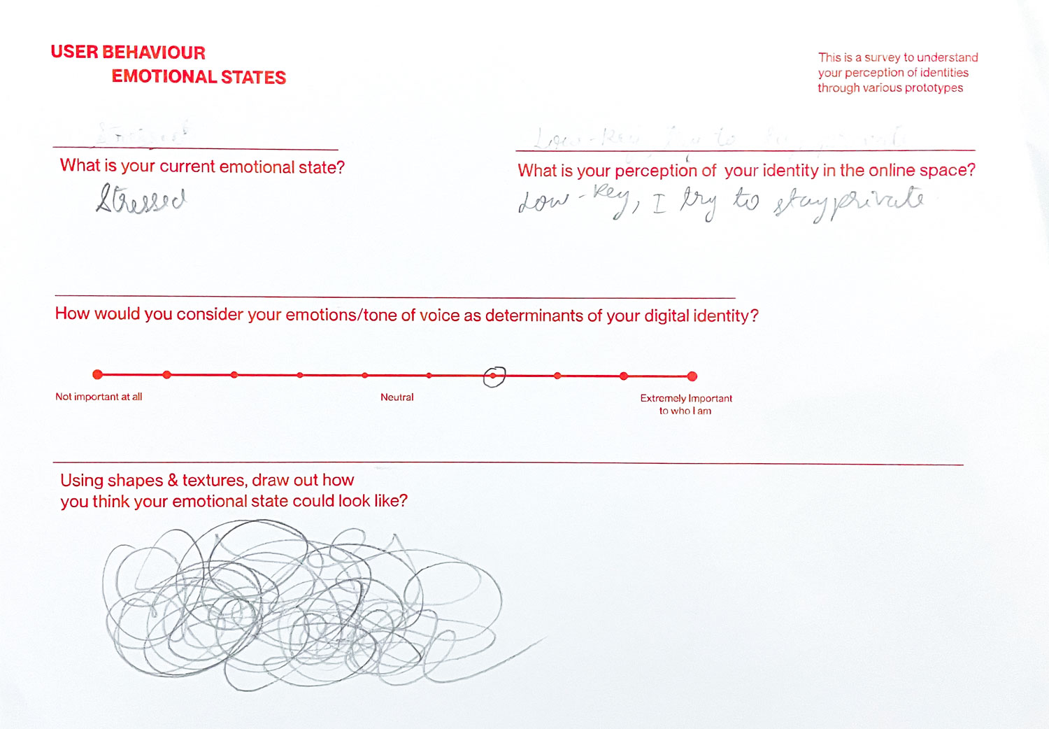
User testing was conducted on digital natives aged 18-29, to determine the effectiveness go digital and physical prototypes in creating a sense of identification within the participants. The target user is first guided through a survey prior to the data collection, to record their current emotional state and their perception of their identity. Then, they are taken through the data collection process using the keystroke analysis simulation. The interface is built to transcribe and analyse the patterns in which the responses were being typed.
From the analysis of keystroke patterns, the emotional state and tone of voice of the user can be derived and an affective data object will be generated to match the result. Likewise, users are able to interact with the digital affective data object to find out which object visually identifies with them. The user can then proceed onto the physical artefacts, to experience the data objects through its texture and compare the sensory experience to the digital outcome.
The affective data objects are presented through different mediums, enables users to gain a well-balanced perception of the data objects through various senses.Lastly, the user-testing is concluded with a Social Identity and Persona Identity scale, where participants can plot their evaluations.
Voice Analyser System
The second prototype leverages on existing scientific research surrounding the analysis of vocal qualities to build an identity tool that is able to use voices to visualise personalities of identities. Vocal characteristics of users are utilised as a form of personal data to embody the intangibility of voices. As first impressions are often made of oneself by associating the voice we hear with an inferred persona. Where physical appearance serves as a visual representation of identities, similarly voices function as an audiovisual cue for one’s identity. This prototype draws attention to the analysis of voice samples as a basis for perceived voice personality.
In the initial stages of this prototype, attempts at recording, collecting and analysing vocal inputs to generate visuals through coded experiments were conducted to programme an interactive interface that could receive vocal inputs, interpret them and produce a visual output. However, limitations such as the processing power of P5.js and the control over the aesthetics of the visual outcome were obstacles faced during these experiments.
Therefore, experiments using TouchDesigner was explored instead as a device that could be used for data collection and analysis. Iterations of visual outcomes were produced as a form of visual study, using vocal inputs to manipulate noise patterns and generative letterforms.


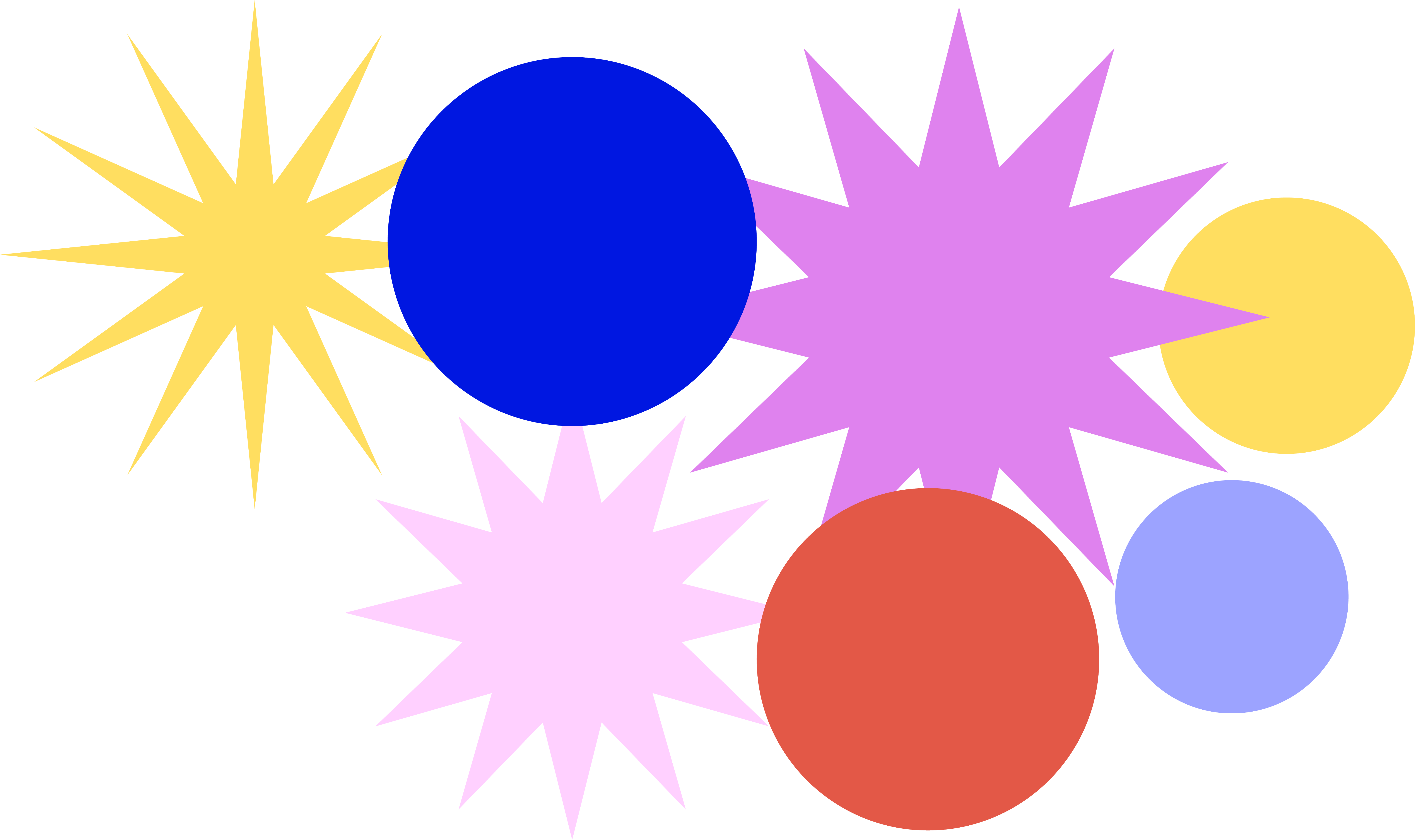
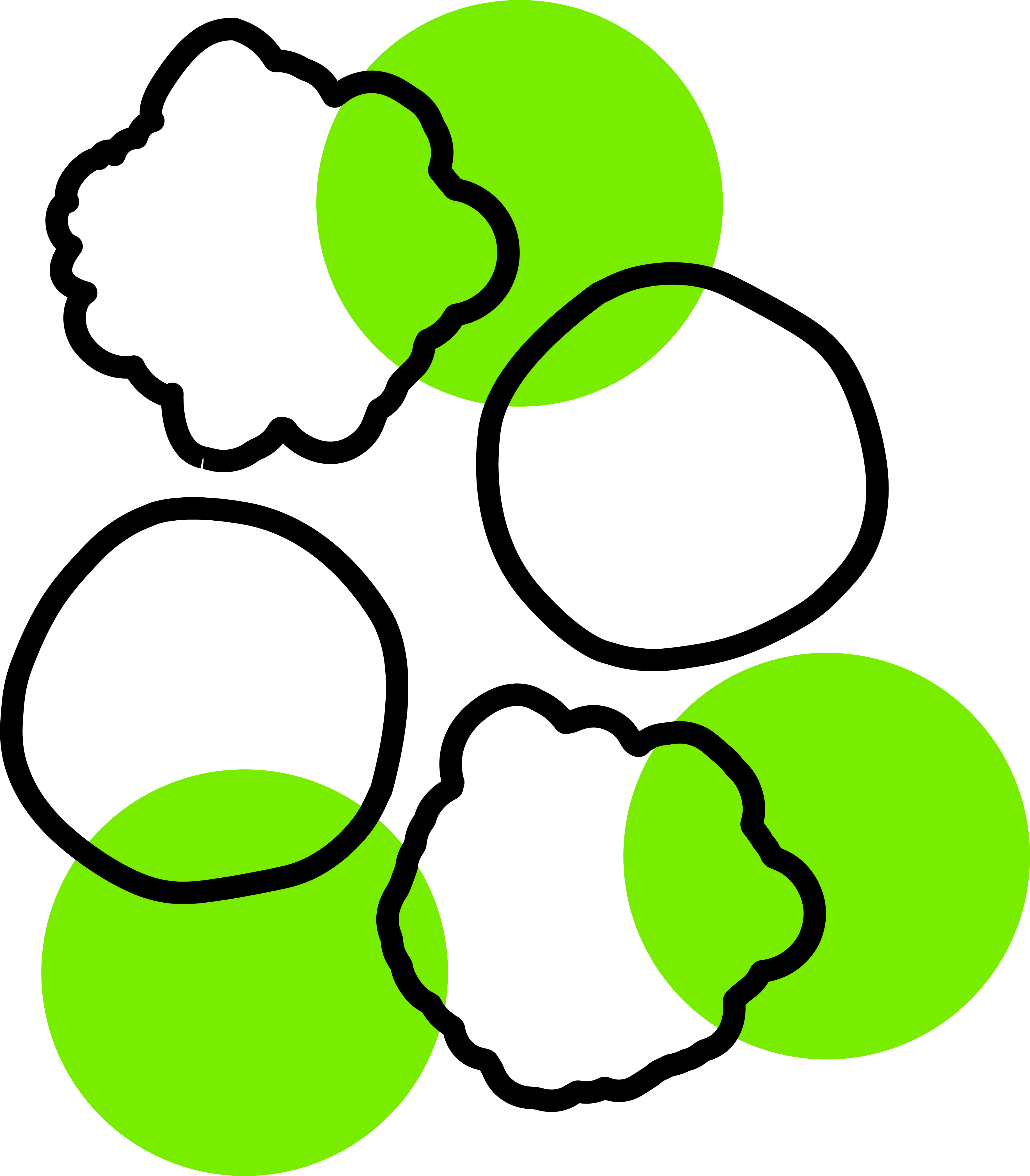
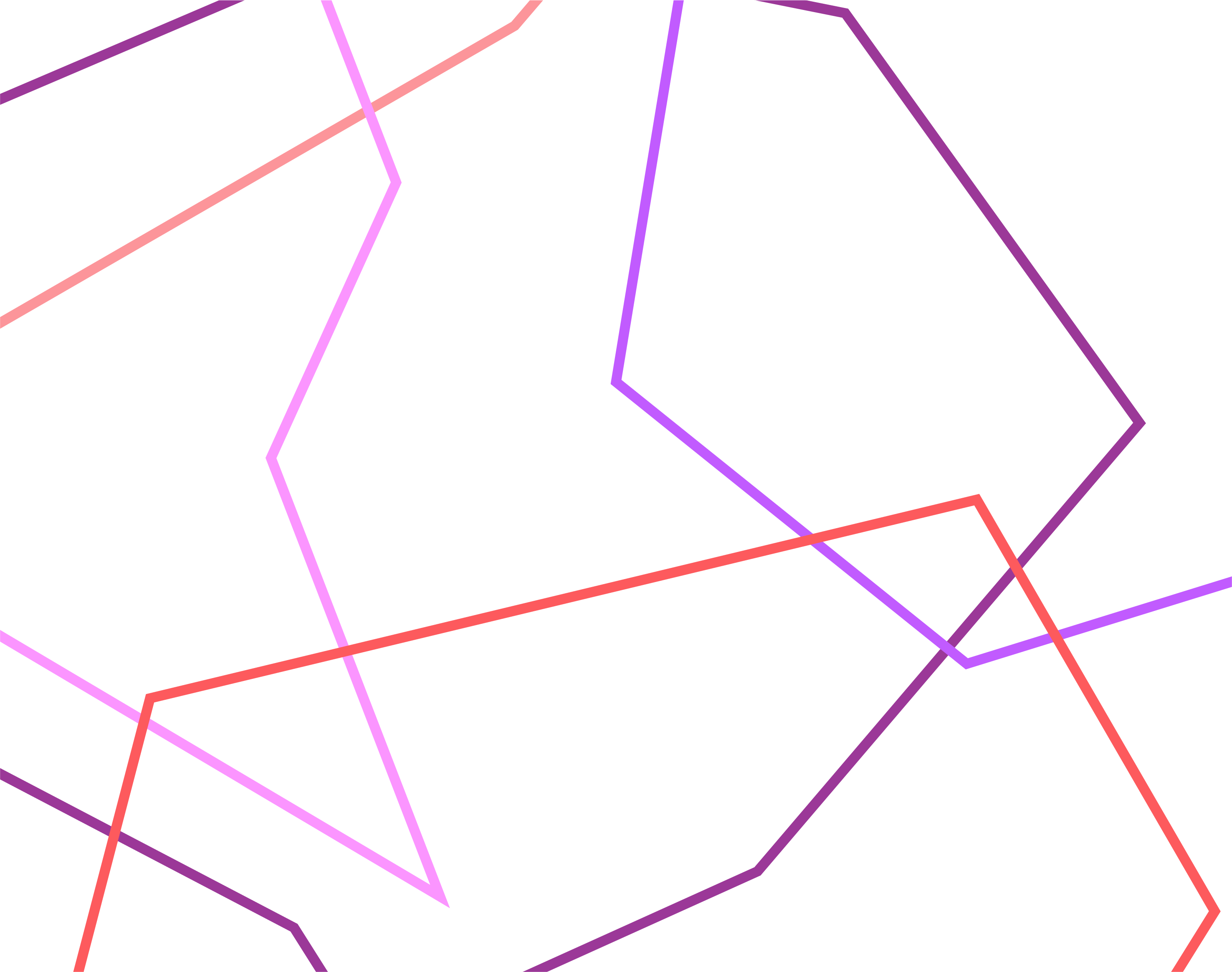
The first experiment references the concept of Voice Online by Ines Iragui, in building a digital tool to represent our tone of voice in the online space. With the growing disconnect between ourselves and others, where humanistic forms of communication is less accessible in the online space, this is especially evident when posting and sharing on social media, where thoughts and experiences are being fragmented and lost while transitioning online. This experiment seeks to portray our identities through the use of visual systems as a representation of our voices in hopes to restore organic communication between users.
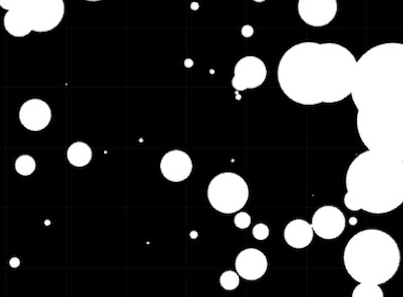
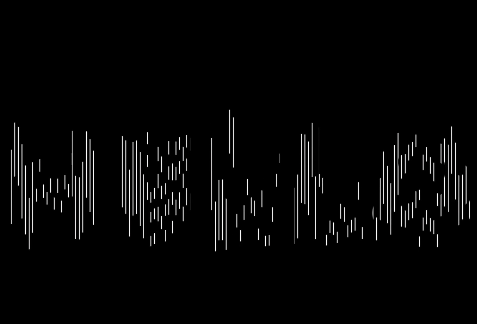
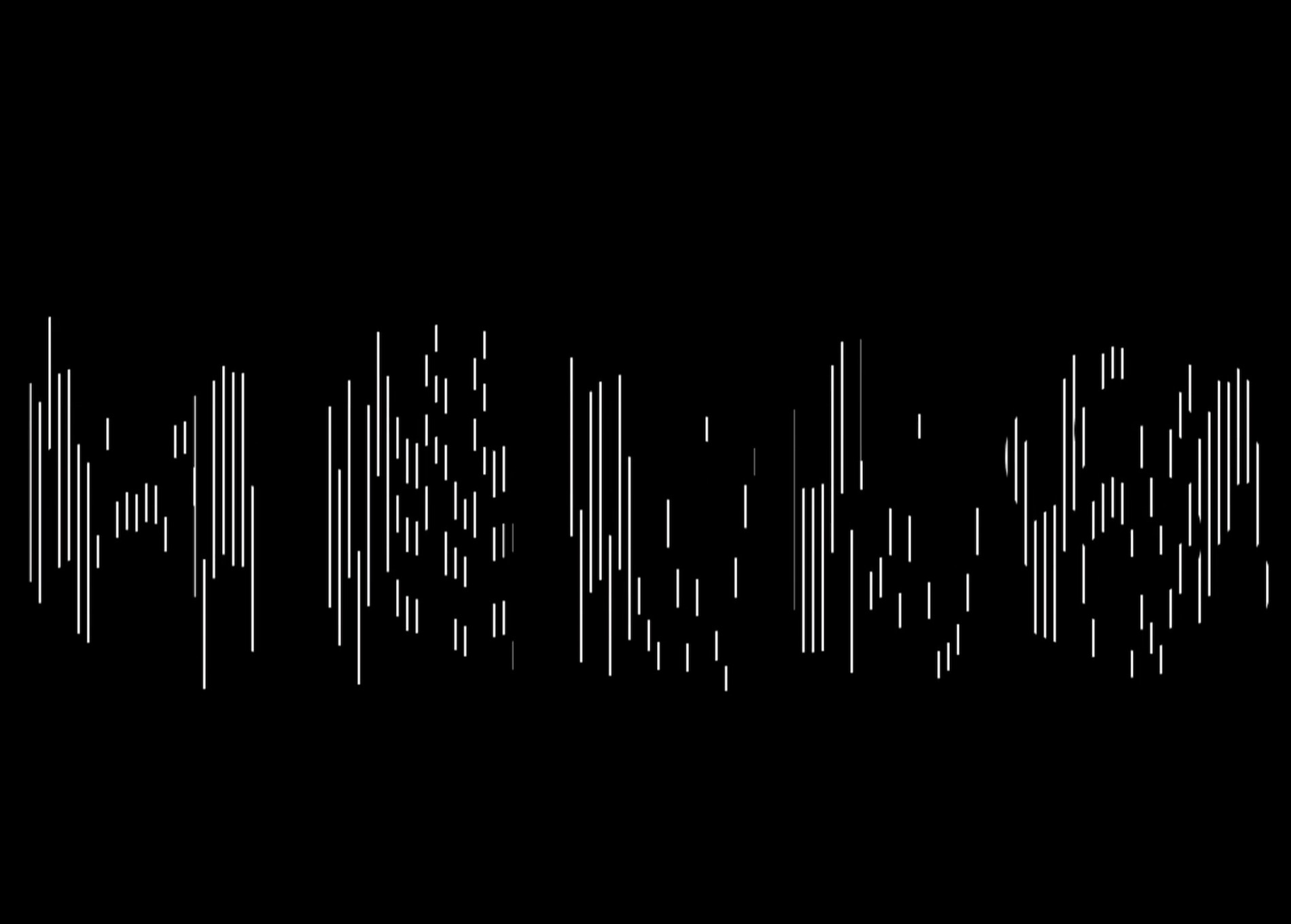
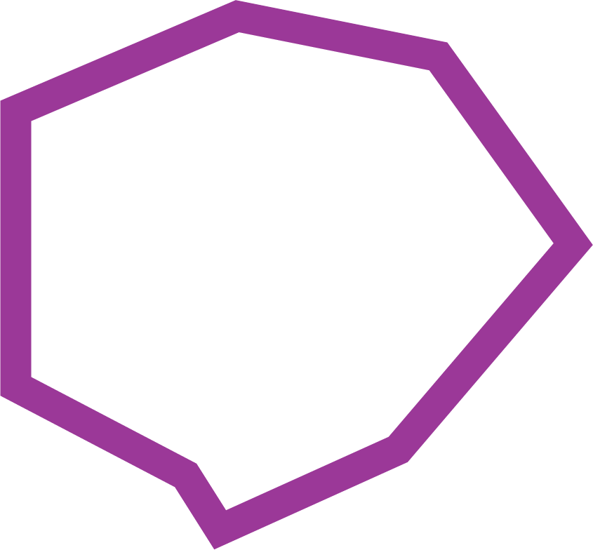
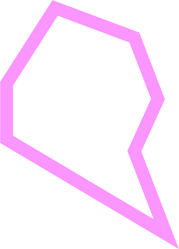
This experiment mainly comprise of circles and stars as the polygon shape can take multiple different forms, making this a flexible basic shape to work with. The different number of edge vertices helps to represent the different types of emotions. The different coloured stars communicate the complex emotive traits, symbolising the emotion behind the voice. The number of edge vertices of each star determines the tone of voice. Lesser vertices forms a more rounded, or square-ish polygon which can be interpreted as a deeper tone of voice, while more vertices forms a sharper star which can represent a louder and striking tone of voice.
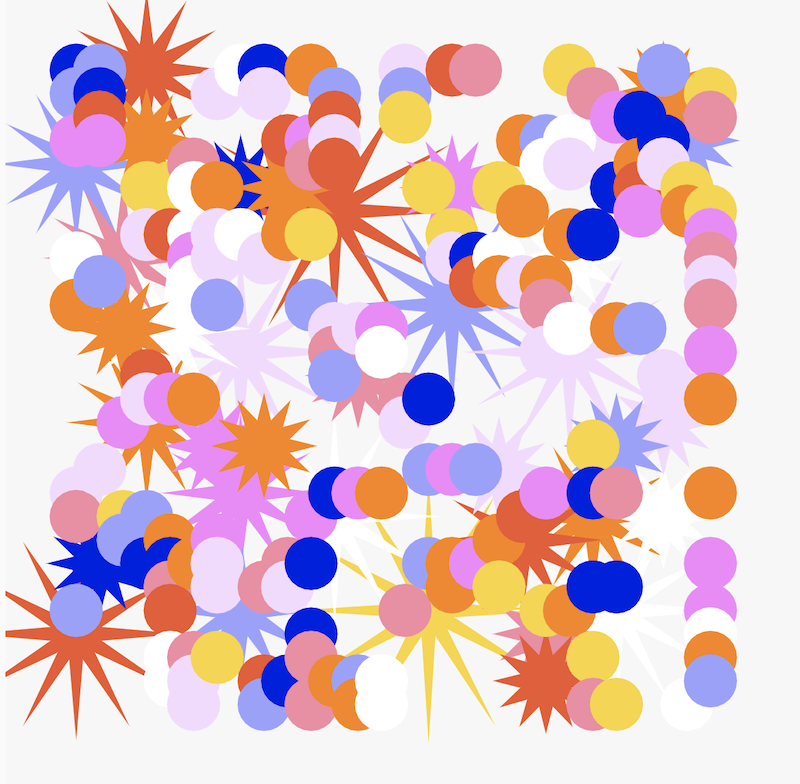
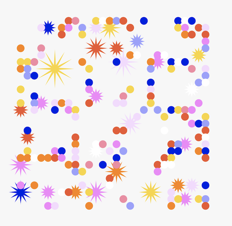
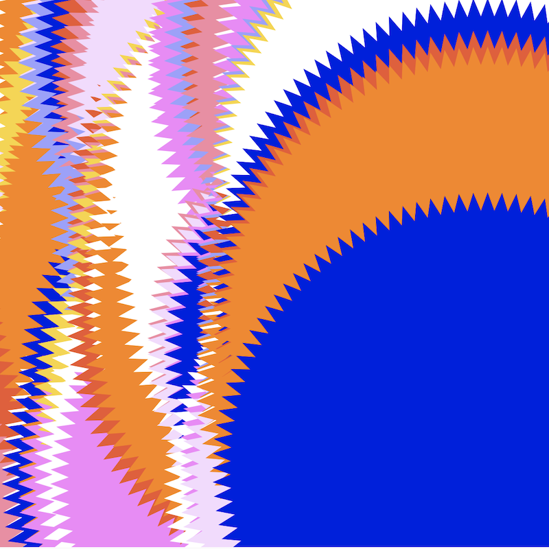
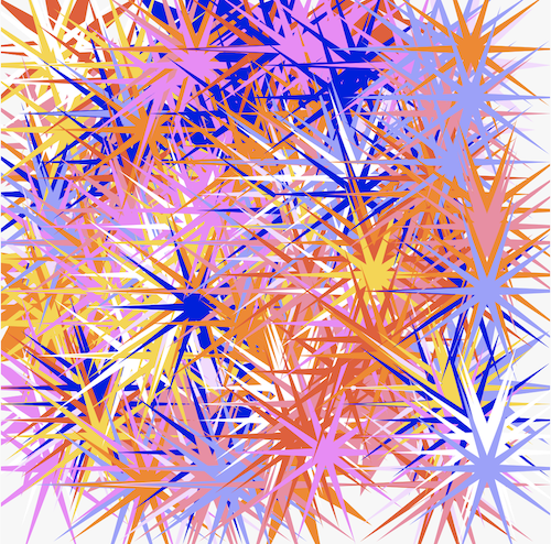
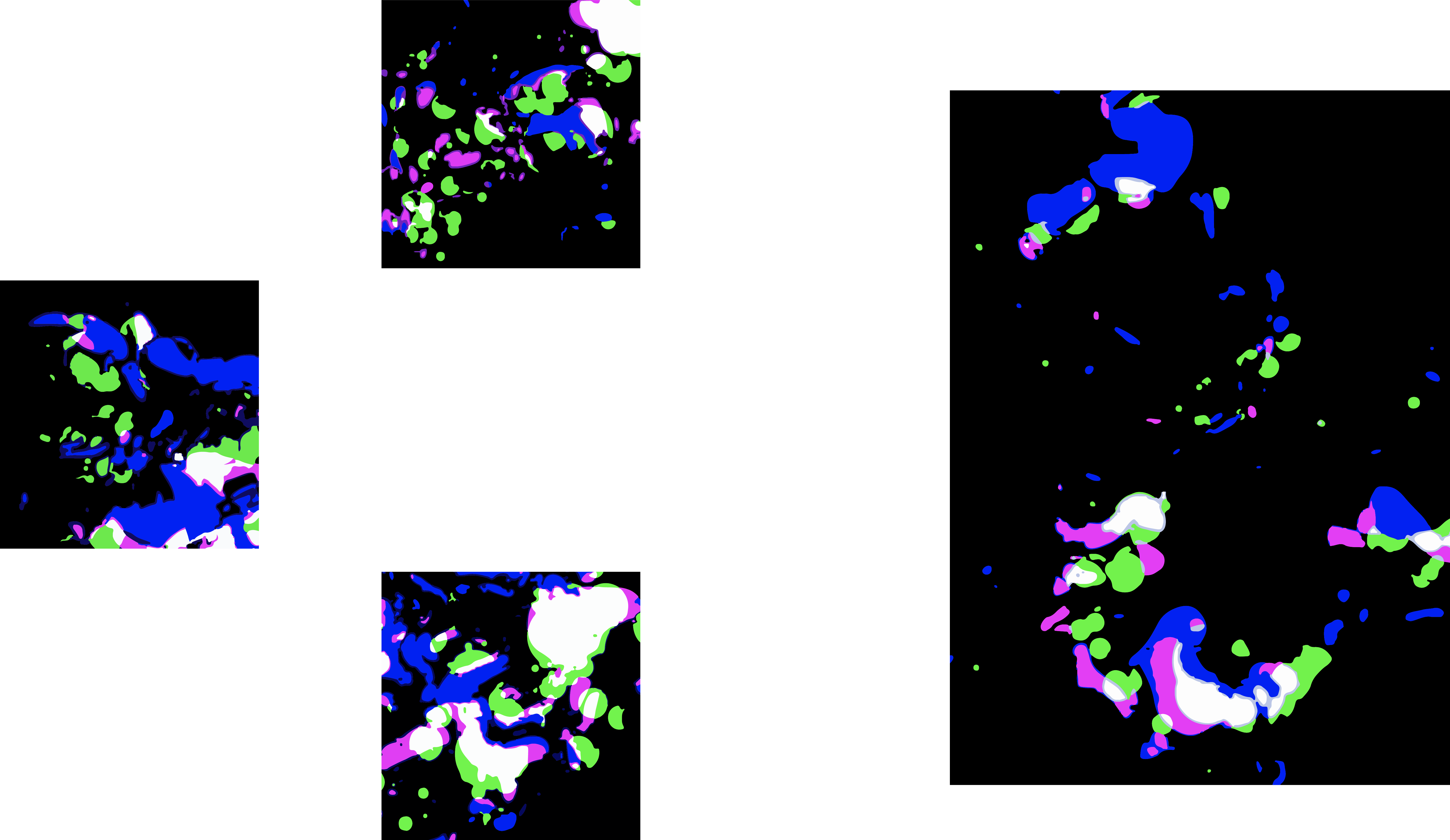
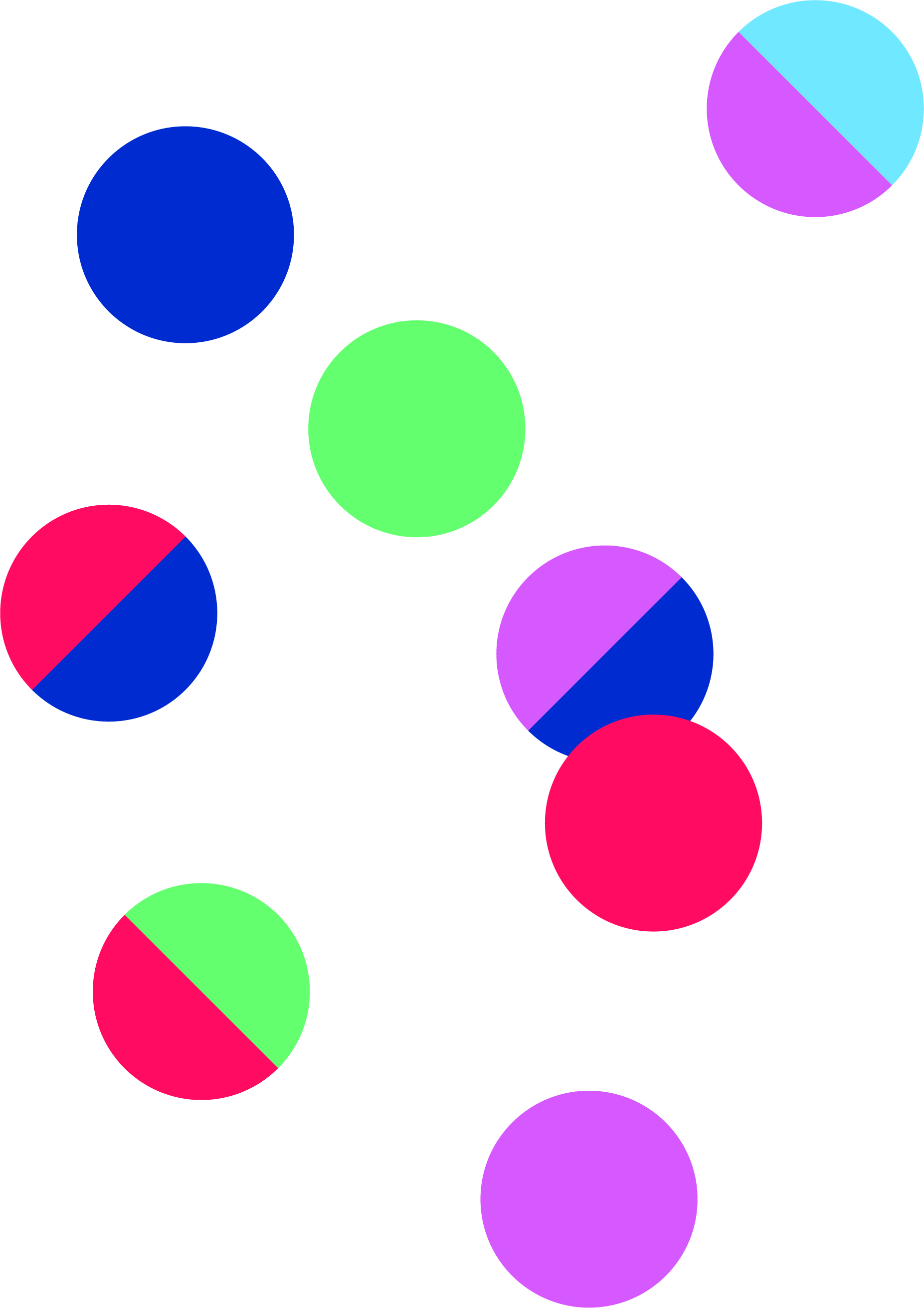
Other explorations following the same idea but with a different approach. This exploration focuses more on solid graphic forms. Using the method of overlapping symbols to create a visual form that represents our tone of voice. This helps to make clearer distinctions between different colours, which allows the user to easily comprehend the emotions behind the visual. However, the different shapes and number of vertices seem to be lost in this exploration, making it hard to distinguish the tone of voice for the visual. Hence it does not accurately depict the tone of voice as a result.
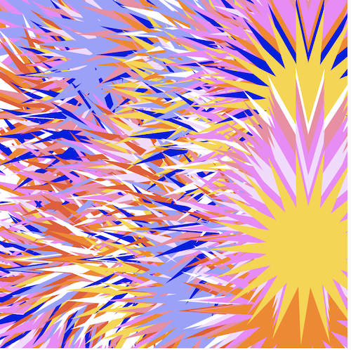
In further explorations, the star vertices are increased to an even higher value which resulted in the above outcomes. The vertices became so thin, that the originally spikey and loud form almost disappears and instead, the thin vertices give off a soft and wispy look which presents a whole new interpretation for the tone of voice here. Constrasting to the intial idea of how spikey, sharp edged shapes connotates a loud tone of voice, when the vertice value is scaled up the sharp edges of the stars creates an optical illusion, altering the look and feel of the visual.
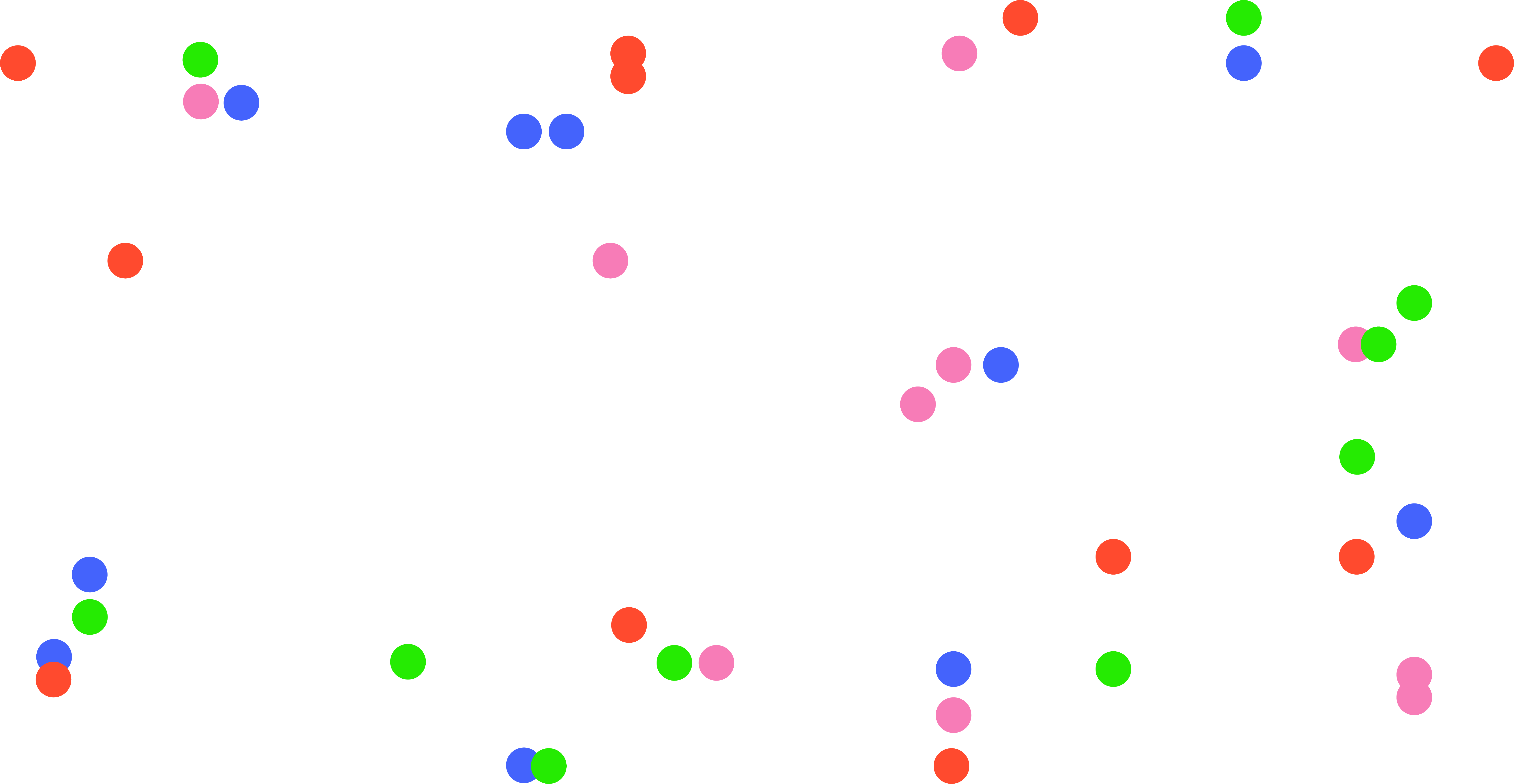
The second experiment is a practice and attempt at using sliders to interact with shapes. In this
experiment, sliders are being used to alter the shape form as a way to represent our fluid digital
identities. In the paper “Home and Identity in Digital Spaces”, Mulji introduces the notion of identities
being fluid and constantly evolving in digital spaces as our identities are not constrained to our
physical roots. Therefore, this experiment tries to visualise this theory by creating a shape that is
flexible and transformative in nature. Slider values are being assigned to the shape, as the slider moves,
the shape is being multiplied to give the illusion of the form being manipulated and distorted. This
experiment also acts as a practice in assigining variables to sliders, and using inputs from the slider to
change the characteristics of the shape.
In the sketch below, the first slider changes the form of the circle, while the second slider gradually
changes the colour of the circle by adding in a gradient as the slider moves.
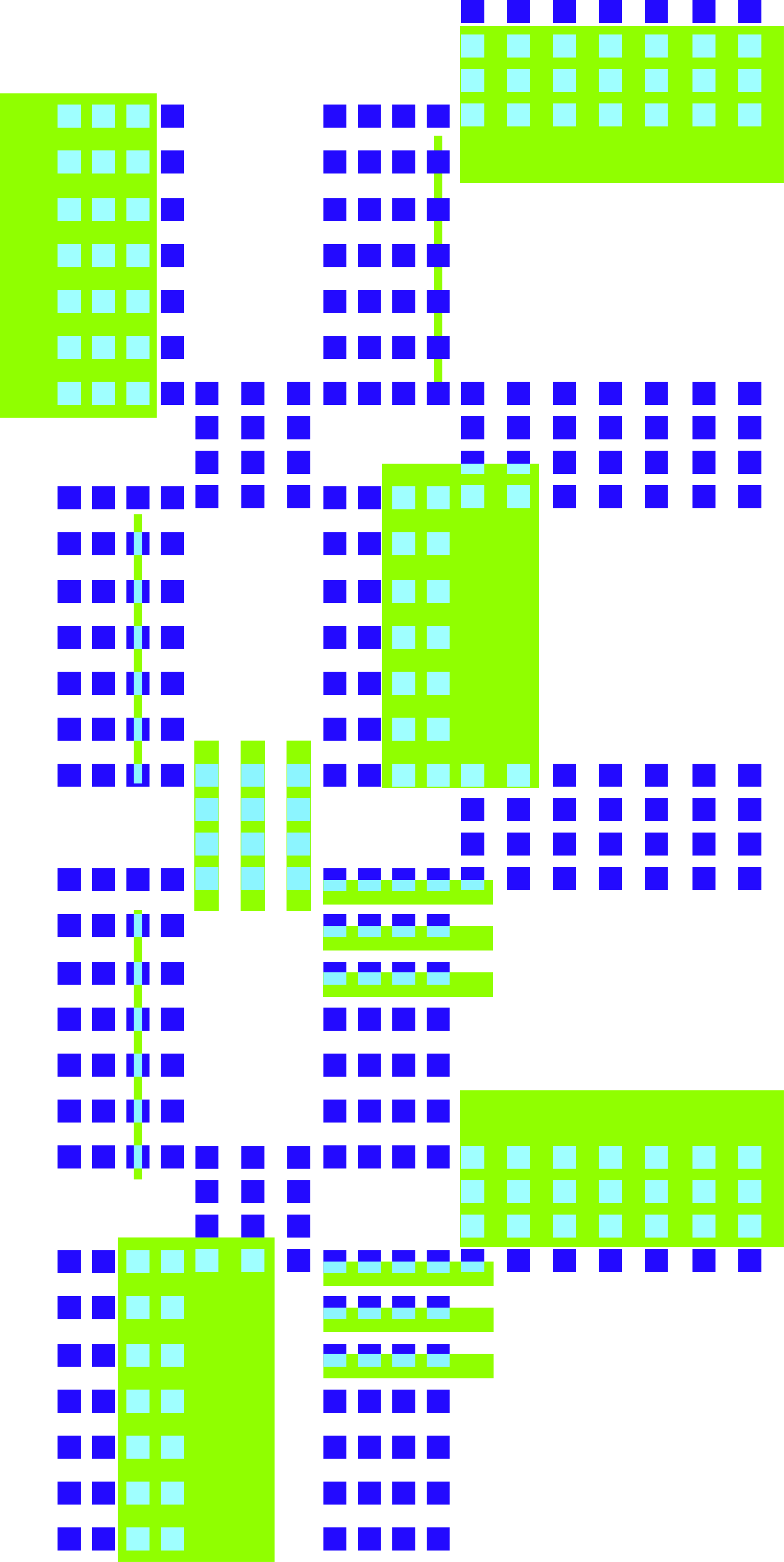
Experiment 3 delves into the making of patterns using grids and shapes. In this experiment the visual
system is made out of basic shapes such as circles, semi-circles, triangles and squares. Four sliders are
used to represent each type of shape or colour. Using the grid system to indicate the positioning of the
shapes on the sketch, when the basic shapes are put together, this forms a pattern. In this experiment,
sliders are being used to explore various functions and elements to interactive with the shapes.
Experiment 3 seeks to discover the possible areas in the sketch that are suitable for user inputs and
evaluate which type of behavioural function when interacted with is effective in portraying an aspect of
personalities
For this experiment, I wanted to try visualising MBTI traits. As many young people nowadays identify
themselves as their MBTI personalities, I think it would be a good starting point to look into MBTI traits
as a representation of our actual identities. MBTI is an easy way for people to identify themselves and
form commonalities with others, hence for some MBTI has become a part of their identities.
First draft–starting out with a grid and assigning each point of the grid with a different type of
shape. Experimentation into how behavioural functions of these shapes that can be manipulated through
the use of slider values. In this draft, a combination of change in scale, colour, rotation, form and
vertex were being explored.
There were also some technical issues that occurred with the grid system as a different shape type is
assigned onto the same grid cell which causes some overlapping of shapes at certain positions. Moving
forward, this is an issue that needs to be resolved.
Another iteration of the grid system, whereby the behavioural changes to the shapes when interacted
is lessened. The sizes of the shapes are constant while the rotation and colours change, to make the
reading process less complex. As the scale of the elements are the same, the pattern looks more neatly
organised as compared to draft 1. However the slider input still made the sketch a little chaotic
because of the rotations and colour changing happening.
In this draft, I attempted to fix the problems with the grid by manually positioning the shapes in the
correct points. It isn’t perfect as some shapes are misaligned, but I would still consider manually
positioning the shapes into the grid system a possible solution to the issue.
The last iteration of this experiment has a more simplified user interaction, where the sliders only change the rotation and colours of the elements. The pattern has also been reduced and simplified, using only semi-circles as its basic shape. The semi-circles are combined to form a circle consisting of two colours. When the slider moves, the values change the rotation of the circle, when rotated, the circle either shows the green or blue semi-circle. As a result, depending on which way the slider moves, the pattern will change in colour accordingly as well.
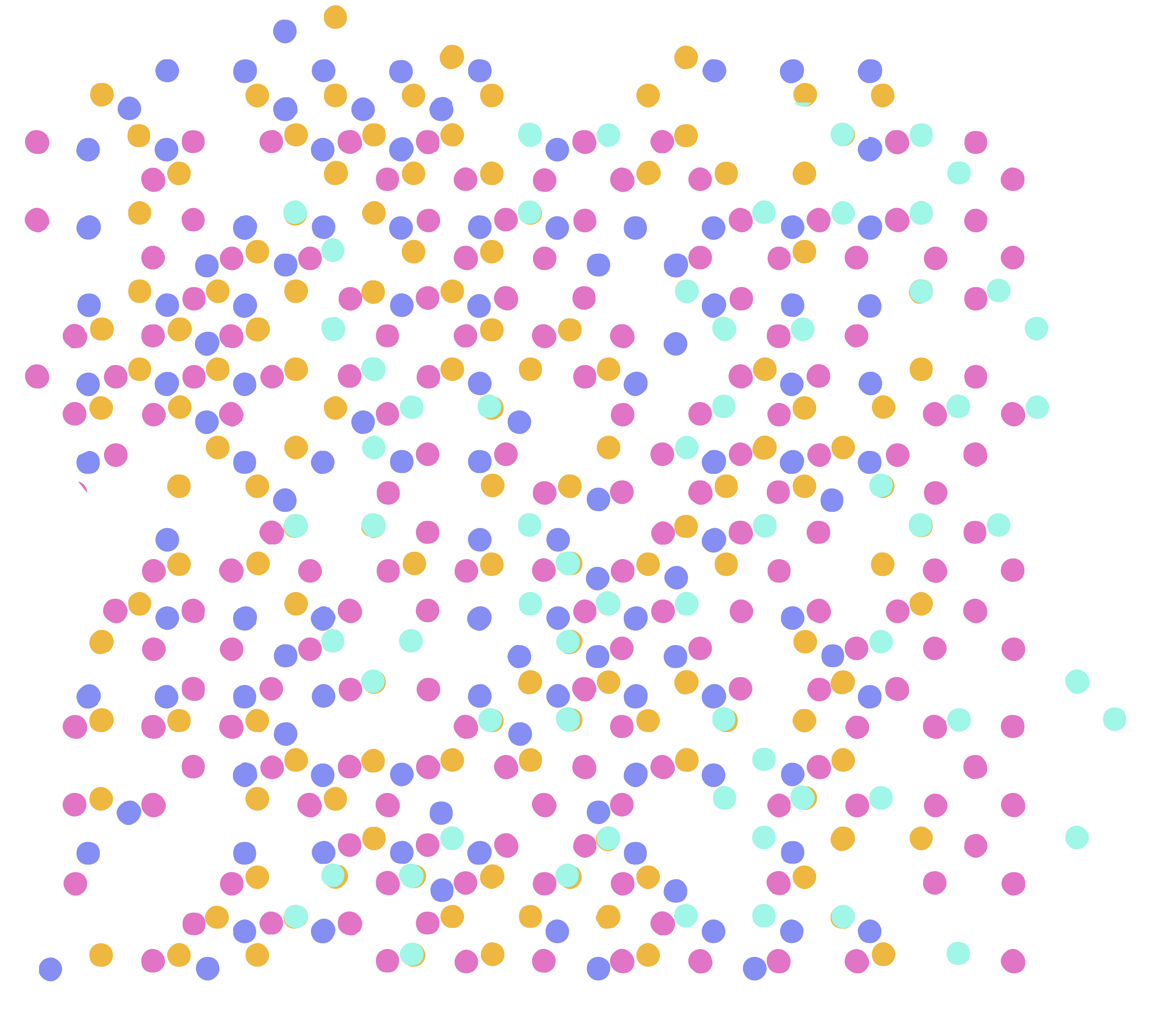
Following the same idea as Experiment 3–using MBTI traits as a representation of an individual’s identity, Experiment 4 aims to produce a workable, simple and readable system that visualises the different types of MBTI. Revisiting the initial idea of using a grid system to build a pattern made up of elements that depict each MBTI trait, the final pattern will then reflect the MBTI personality based on the MBTI traits that is being mapped onto the sliders by the user. As opposed to Experiment 3, which looks into the formation of patterns through the use of grid systems, Experiment 4 focuses more on creating a user-friendly and easily comprehensible tool that reflects the user’s identity. As such, the design of the pattern is kept to a minimal and instead more emphasis is placed on the functionality of the system to help users visualise their MBTI personalities
Introversion (I) – Extroversion (E)
Intuition (N) – Sensing (S),
Thinking (T) – Feeling (F)
Judging (J) – Perceiving (P)
Referencing the Myers-Briggs Personality Type Dataset, each slider will be used to represent an axis:
Cyan circles will symbolise Introversion (I) – Extroversion (E), Pink circles will symbolise Intuition (N)
– Sensing (S), Yellow circles will symbolise Thinking (T) – Feeling (F), Purple circles will symbolise
Judging (J) – Perceiving (P)
Using only circles and different colours to symbolise different MBTI traits, the MBTI personality will be
constructed from the basic shapes to lessen the abstraction of the visual. The grid system maps a
different coloured circle in each cell and the user’s input from moving the sliders will determine the
visibility of the circles. As such, when you move the sliders, the number of circles will increase and
appear on the grid. For example, if you are more extroverted than introverted, there will be more cyan
circles, if you are more on the side of intuition than senses, there will be lesser pink circles. Usually,
people who have take the MBTI test would already know which letters make up their MBTI trait, thus they
can use this tool to visualise their personality. After mapping your MBTI traits, a system of coloured
circles will showcase your MBTI personality through the pattern.
This experiment focuses on the concept of behavioural data as a means for the construction of identities
in the digital space. In the book “Self-tracking cultures: towards a sociology of personal informatics” by
Deborah Lupton, she establishes the idea of behavioural data, whereby users’ data that has been recorded
and collected by technological devices can be analysed to reveal unknown behaviourial patterns, habits,
experiences of oneself. Therefore, through the visualisation of such data, it allows one to gain
self-knowledge and rediscover their digital identities.
Using screentime as a type of behavioural data, this experiment utilises data collected from the usage of
devices for various purposes to visualise one’s identity.
To conduct this experiment, a few preparation is needed before proceeding to
visualisation.
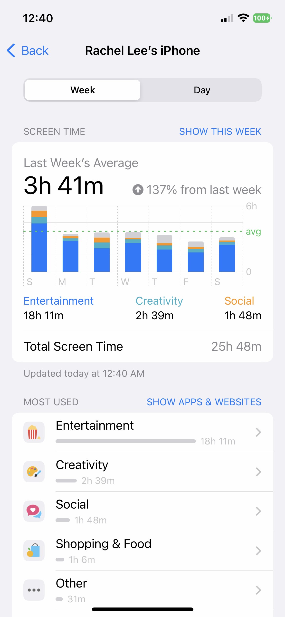
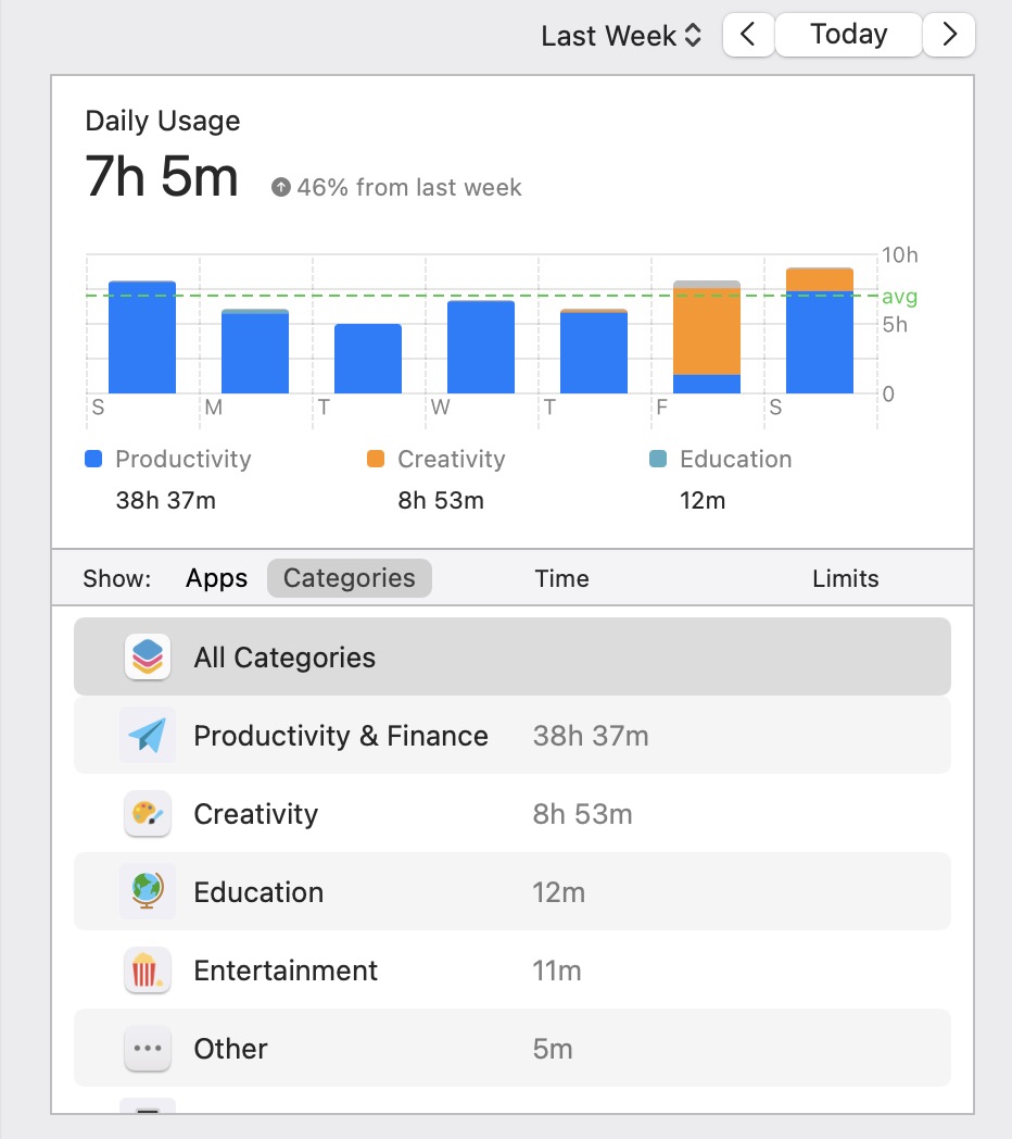
I used my device's screen time function to track the app usage for a period of one week. However, at the
end of the week I realised that the phone’s screen data does not accurately portray all of my online
activities as I mainly use the phone for social and entertainment purposes and the desktop for schoolwork,
thus if I were to use only the phone's data, it might be an inaccurate data representation as the phone
does not cover all of my digital activities. Heence I decided to combined my phone and computer data in
order to derive a more cohesive representation of my online data
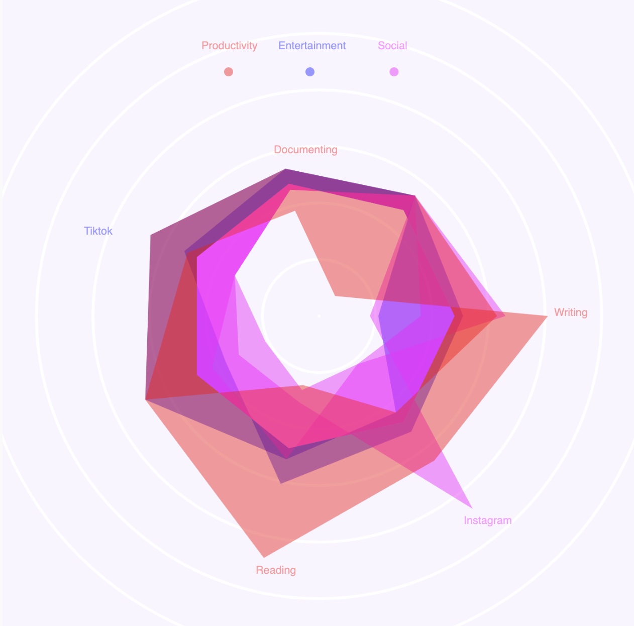
Productivity
Entertainment
Social
Usage of
Screentime
Data
Here are the desktop and mobile screentime in one week. I chose to show the categories instead of the apps to show a more distinct comparison between the different usage of screentime on devices. For the categories, I decided to go with the top three which was Productivity / Creativity, Entertainment and Social as those were the most prominent usages of screentime for me.
How to read
the
data
visualisation?
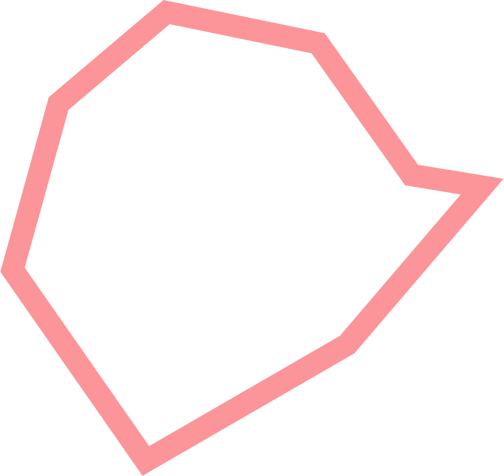
The collected data is mapped to a hexagonal shape that is categorised through three main factors: Productivity, Entertainment, and Social. Each hexagonal factor represents a type of activity, and each vertice is labelled according to the apps used for the activity. The most prominent vertice shows the app that is being used the longest for each category. The larger the hexagonal shape, the more time is spent on the type of activity
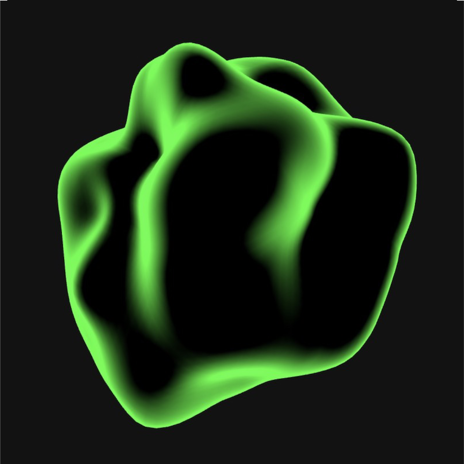
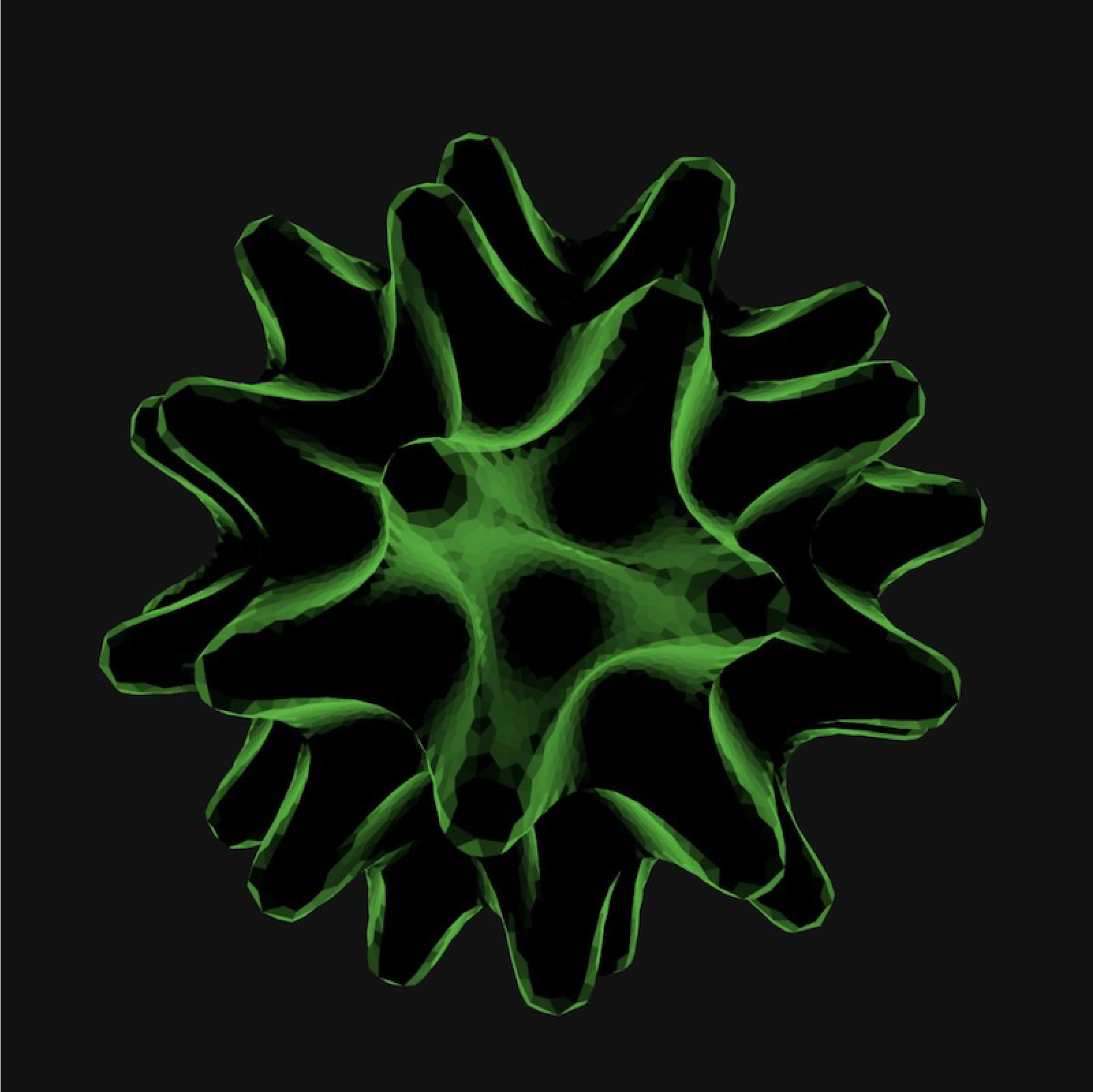
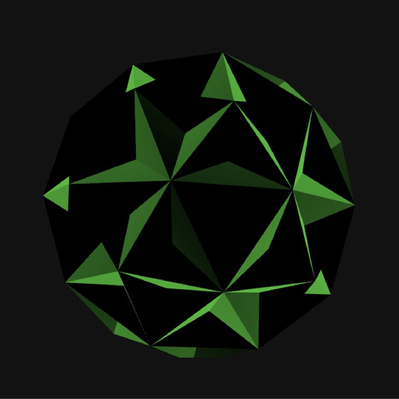
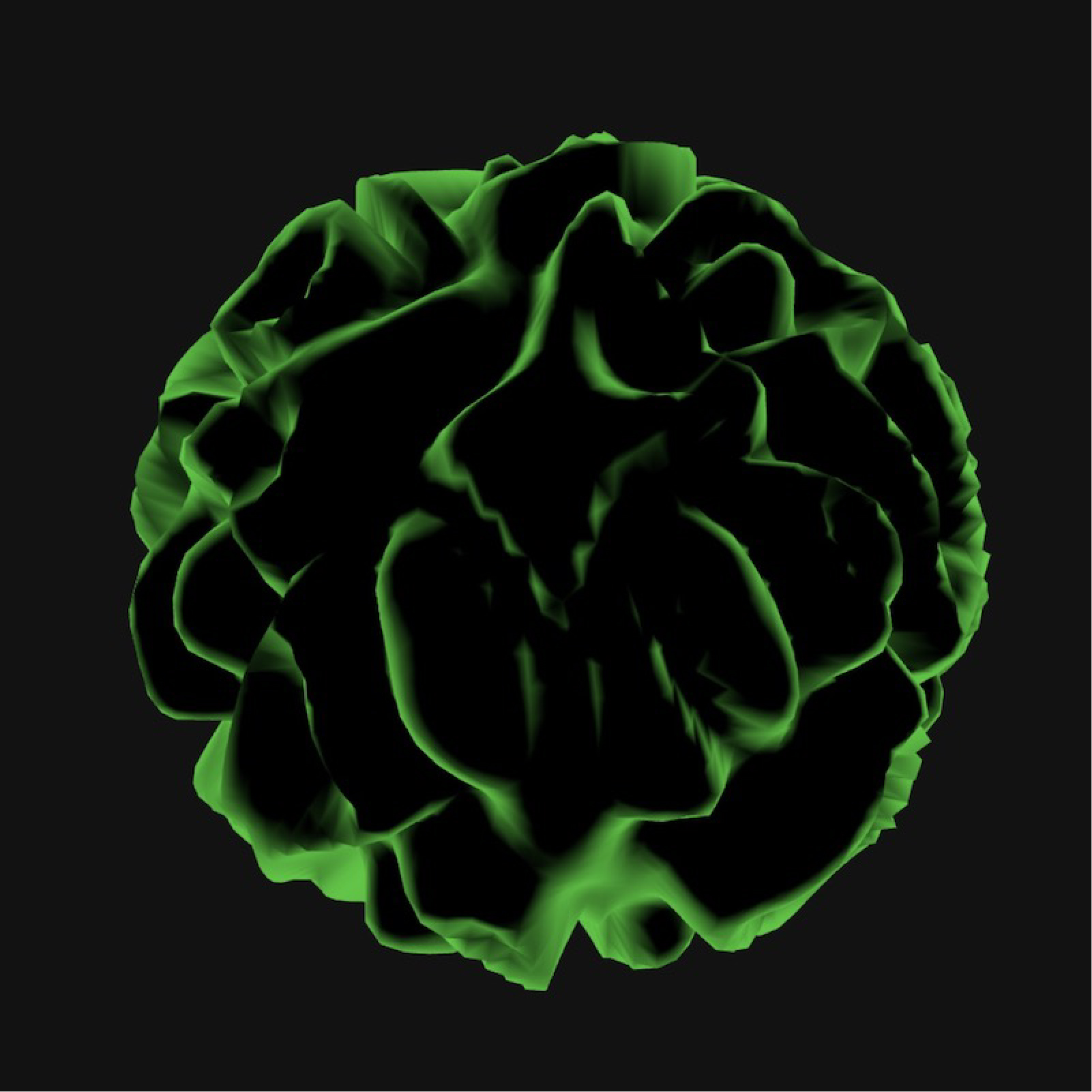
This experiment looks into visualising the emotions and tone of voice of individuals. As part of one’s behavioural traits, emotions and tone of voice withhold qualities of the an individual’s identity. This experiment is a reattempt to visually represent identities through voices. The concept for this experiment revolves around creating a visual that is ever-changing and fluid in motion to mirror the idea of a voice as something that is intangible, transformative and active, through a blob that is ever-changing to reflect the shape and colour of our voices.
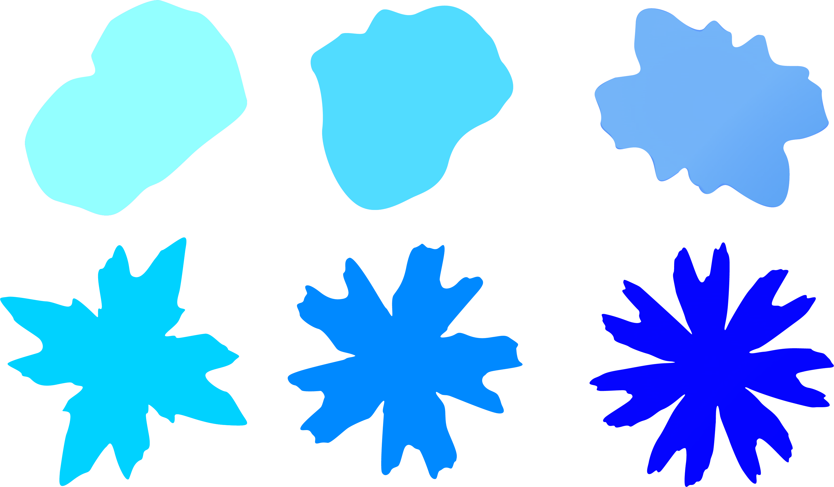
The sketch on the right uses shapes and colours as the primary determining factors in the visualisation of identities. Sliders are put in place to control these two factors, the slider values will display different iterations of the visual allowing the user to pick which variation best represents their identity. The tone of voice of the user is reflected through the form of the shape. The complexity of the shape increases as the slider values change. According to Lunterova, quote “the shapes are deeper and more chaotic, representing an intense and active emotional state. the shapes are more orderly, representing a calmer emotional state”. The complexity of the shape also has the ability to carry symbolic meaning about an emotional state. Emotions are also represented through different colours, the slider provides a range of primary and secondary colours which allows for a more diverse representation of emotions.
Further explorations
using gradients
to portray emotions
While mindmapping my ideas, I came across this artwork by Lesia Izikova, called Gradient Moods, which
inspired me to experiment using gradients for the colours of the shape.
At times there might be
multiple emotions at play, hence I thought it would be helpful to portray emotions using gradients
instead–where one's voice is not restricted to only one emotion, but several.Gradients allows for a wider
spectrum of colours and does not subject the visual to only one represetative colour, therefore it would
help to portray the complexity of emotional states better.
This is still a work-in-progress trying to make the gradients customisable through the sliders and some
refinements needed for the background as well. This will be an experiment to come back to in the future.